


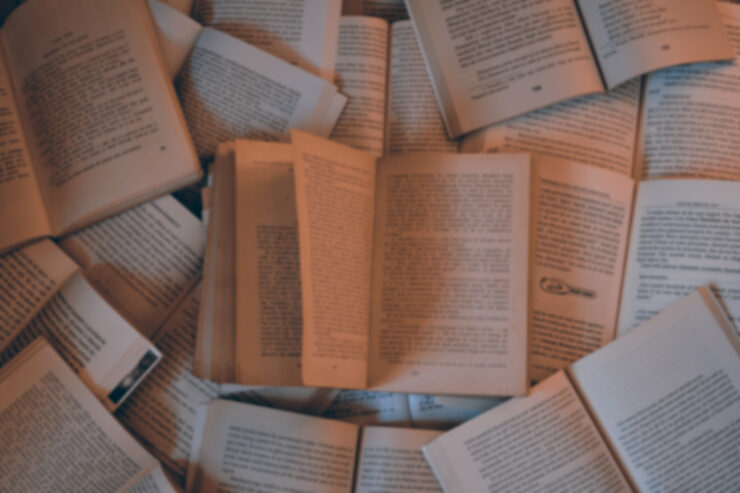
Ideally, the experience of reading a book is entirely driven by the author’s narrative choices. In actual practice, there are many elements that can complicate or undermine the process of transforming arbitrary marks on paper into a guided hallucination. Don’t believe me? Here are five, arranged in order of increasing importance to me.
But first, a disclaimer! None of the following are under the author’s control, so please keep that in mind.
A bugaboo I discovered when I began collecting the books published by the otherwise exemplary Haikasoru imprint has to do with the orientation of the book’s title on the spine of the book with respect to the text inside the book. In short, if the title on the spine is right way up, I expect the words on the page to be right way up when I open the book. Opening the text to discover I am holding it upside down kicks me out of the reading experience. Haikasoru eventually stopped orienting their titles in an idiosyncratic way, yay…but until then it was a distraction.
Don’t let that stop you from running out and buying every book in the Haikasoru line. The works themselves earned their places on my shelves.
Until I began my “Because My Tears Are Delicious to You” reviews of works I’d read as a teen, I had no idea how much it bothered me to read a familiar book in an unfamiliar cover. This is completely stupid, like getting annoyed because the Christmas wrapping on a present is wrong. In a lot of cases, the art on recent editions is far superior to that available on ancient editions. Yet, some part of my brain seemingly immune to concussion and anoxia insists the cover is a core part of the reading experience and that reading a familiar book with novel art is a different experience from the original reading.
Ideally, every book in a particular series should have a pleasing consistency of format and size. In reality, there’s probably a law named after a famous collector that this is almost never true in practice. The publisher opts for slightly different heights, or jumps from paperback to trade to hardcover, or the series itself jumps publishers and the new installments look radically different from previous volumes. The perfection of ones’ bookcases is unavoidably marred.
I’ve largely come to terms with this issue, except when I suspect that the reason for the change is that the publisher knows about people like me and hopes I will rebuy the series from scratch. Happily, my twitchiness about cover art immunizes me.
From time to time, publishers will discover to their alarm that the venerable classic they are considering reprinting displays its age in some troubling and unacceptable way. One answer is to have some hard-working editor pore through the text to replace the choices of a bygone era with setting details and vocabulary more appropriate to the modern day. It can be surprisingly difficult to do this seamlessly. When mishandled, an update will introduce tooth-grindingly vexing continuity errors. In particular, I remember a series split between two publishers, where one publisher diligently removed references to the Cold War, while the other…didn’t.
Finally, if a book is part of an ongoing series, I want to learn this before I purchase the book, not when I reach the final page to discover a notable lack of ending. Most of the issues I mention above are arguably merely matters of taste, but this one isn’t. It’s just good manners to let readers know if they are purchasing a complete experience or a single episode in a narrative too mighty to fit between two covers.
***
No doubt many of you have your own little quirks that affect the reading experience far out of proportion to their actual importance. Feel free to regale us with them in comments before (but as always, the moderators ask that you keep the tone of the discussion civil and polite…)
In the words of fanfiction author Musty181, four-time Hugo finalist, prolific book reviewer, and perennial Darwin Award nominee James Davis Nicoll “looks like a default mii with glasses.” His work has appeared in Interzone, Publishers Weekly and Romantic Times as well as on his own websites, James Nicoll Reviews (where he is assisted by editor Karen Lofstrom and web person Adrienne L. Travis) and the 2021, 2022, and 2023 Aurora Award finalist Young People Read Old SFF (where he is assisted by web person Adrienne L. Travis). His Patreon can be found here.