


Christopher Tolkien died last week at the age of 95. The third of J.R.R. Tolkien’s four children, he was his father’s literary executor and the editor of his posthumous works. He whipped The Silmarillion into publishable shape (with the assistance of a young Canadian philosophy student named Guy Gavriel Kay, whom we would hear more from later) and edited volume after volume of his father’s early drafts and other fragmentary tales.
But before that, Christopher Tolkien was his father’s first reader—and his cartographer. And while his obituaries mention the fact that he drew the first published map of the west of Middle-earth, which appeared in the first edition of The Fellowship of the Ring in 1954, they do so in passing, the map overshadowed by his later editorial and curatorial work.
I think that’s a mistake. Christopher Tolkien’s map proved to be a huge influence on the fantasy genre. It helped set the norm for subsequent epic fantasy novels; indeed it became the norm. Epic fantasy novels would come with maps—were supposed to come with maps—and in many cases those maps would look a lot like the one drawn by Christopher Tolkien.
So it’s worth taking a closer look at this map…
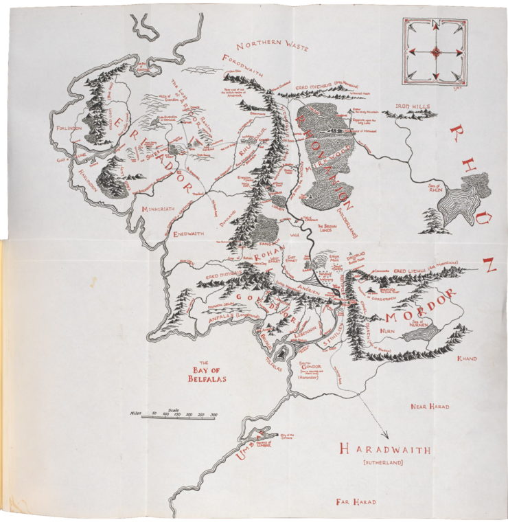
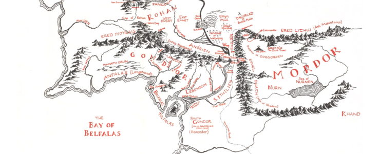
…or rather maps. He was responsible for all three maps that appeared in The Lord of the Rings: the main, small-scale map of Middle-earth and the larger-scale maps of the Shire and of Gondor and Mordor that appeared in the first and third volumes, respectively. He also drew the map of Beleriand for The Silmarillion.
Christopher Tolkien’s cartographic work had in fact begun even earlier: he drew maps of Middle-earth throughout the writing of The Lord of the Rings. “In 1943 I made an elaborate map in pencil and coloured chalks for The Lord of the Rings, and a similar map of the Shire,” he wrote in The Return of the Shadow. It was a map and a task that the elder Tolkien, who was unhappy when his son “was dragged off in the middle of making maps” to RAF flight training in South Africa (Letter #98, The Letters of J.R.R. Tolkien), relied on.
The need to produce maps for The Lord of the Rings bedevilled Professor Tolkien, who had to make the narrative fit the geography and vice versa, as the publication deadline approached. “The Maps. I am stumped. Indeed in a panic. They are essential; and urgent; but I just cannot get them done,” he wrote to his publisher in October 1953. “I have spent an enormous amount of time on them without profitable result. Lack of skill combined with being harried. Also the shape and proportions of ‘The Shire’ as described in the tale cannot (by me) be made to fit into shape of a page; nor at that size be contrived to be informative” (Letter #141).
His own working maps were rough sketches, pencilled and inked and corrected over and over. Making something fit for publication was a task that fell to his son. In a letter to Naomi Mitchison, who read The Lord of the Rings in galleys, he apologized for not providing her with maps, but promised them in the published version. “These have been drawn from my less elegant maps by my son Christopher, who is learned in this lore. […] I may say that my son’s maps are beautifully clear, as far as reduction in reproduction allows; but they do not contain everything, alas!” (Letter #144)
For all his father’s praise of his work, Christopher would later describe the main map of Middle-earth as having been “made in haste” and full of “defects and oddities,” including several spelling errors. When he re-drew the map to allow for more detail and clarity (and to correct misspelled place names) for the publication of Unfinished Tales in 1980, he wrote, with perhaps too much self-deprecation, a disclaimer that
the exact preservation of the style and detail (other than nomenclature and lettering) of the map that I made in haste twenty-five years ago does not argue any belief in the excellence of its conception or execution. I have long regretted that my father never replaced it by one of his own making. However, as things turned out it became, for all its defects and oddities, “the Map,” and my father himself always used it as a basis afterwards (while frequently noticing its inadequacies).
That “style and detail” was replicated not only in the revised 1980 map, but also in the 1977 map of Beleriand for The Silmarillion. (The larger-scale map of Gondor and Mordor for The Return of the King used contour lines instead of hill signs, and is something of an anomaly design-wise.) Taken as a whole, Christopher’s maps shared several design elements that are now commonplace in fantasy maps.
The places that appear on these maps are what have come to be seen as the normal stuff of fantasy maps: primarily physical landforms like mountains, rivers and forests, to which cities, towns and fortresses are added, along with bridges and some (but not all roads); with the exception of the boundary between Gondor and Rohan on the large scale map for The Return of the King, no political borders are shown.
Mountains, as you might expect, loom large. I’ve said before that mountains are ubiquitous in fantasy maps: it’s hard to imagine such a map without a healthy range of mountains. And mountains are, for good or ill, a hallmark of the topography of Middle-earth, whether they be Misty, Lonely, or Fiery. So there are a lot of mountains on these maps. But what’s notable about them is how well drawn they are. Mountains on modern fantasy maps range from perfunctory strokes to clone-stamped icons; Christopher Tolkien’s mountains have shadows and detail, and moreover they correspond closely to the text: you can clearly see Methedras at the foot of the Misty Mountains, and the Mountains of Moria, Caradhras, Celebdil, and Fanuidhol, even if they’re not labelled.
His forests are similarly detailed: they’re portrayed by close clumps of individual trees, with trunks visible along the southern edges. Where labels are overlaid on a forest—e.g. Mirkwood, and several forests on the map of Beleriand—the trees leave room for the letters, which I think is kind of neat. Also in Beleriand, the wooded uplands of Dorthonion are represented with scattered conifers rather than closely bunched deciduous trees.
Buy the Book
The Unspoken Name
There’s a lot of exacting detail work on these maps, and that extends to the use of lettering. Other fantasy maps tend to use an italic or even uncial script, but Christopher’s maps mostly used roman letters of varying thicknesses, in upper and lower cases. In the hardcover editions, the maps are printed in black and red ink: the physical features are in black, the labels in red. (This makes the maps significantly easier to read in the hardcover editions. That, plus the fact that they’re much larger: in the first editions the maps folded out, too.)
In the first Middle-earth map, major regions are labelled in Roman capital letters of varying size and thickness. Where emphasis or size is required (“MORDOR” and “RHÛN”), Tolkien thickens the full strokes like a Didone font. Less significant places are labelled with smaller capitals, a mix of caps and small caps, or caps and lowercase letters, depending on importance and size. The smallest places on the map, such as most settlements and fortresses, are in tiny lowercase letters. Lowercase is also used where an English translation accompanies an Elvish name, e.g. “ANFALAS (Langstrand).”
Though the use of uncial letters is now almost inseparable from maps of Middle-earth, thanks to a poster map by Pauline Baynes and, more recently, the maps drawn by Daniel Reeve for the film trilogy, the first Middle-earth map makes little use of them: they’re used for the Sindarin names of mountain ranges, as well as on the label for Arnor—one of two defunct realms labelled on the map. (The 1980 map labelled the lost northern kingdoms with faint outline letters to distinguish from contemporary labels. It also standardized the letterings.)
While the map is notable for its numerous blank spaces, in other places the map is dense with labels. Unlike many maps in the pictorial map tradition, Christopher Tolkien’s maps respect scale. Locations of great importance are not disproportionately large. On maps of Middle-earth, Minas Tirith, Osgiliath and Minas Morgul are crowded together; in a mass-market paperback they’re just barely legible. Moria and Isengard, surrounded by mountains, are equally hard to find. (In the maps for the Ballantine mass-market paperback editions I read growing up, drawn by someone else, Moria and Isengard were simply left off the map, which confused the hell out of young me.)
It’s why the larger-scale map of Gondor and Mordor was required for The Return of the King, a map that father and son scrambled to finish in time, as a draft letter to H. Cotton Minchin (wait, Tolkien wrote drafts of his letters?) reveals:
As ‘research students’ always discover, however long they are allowed, and careful their work and notes, there is always a rush at the end, when the last date suddenly approaches on which their thesis must be presented. So it was with this book, and the maps. I had to call in the help of my son—the C.T. or C.J.R.T. of the modest initials on the maps—an accredited student of hobbit-lore. And neither of us had an entirely free hand. I remember that when it became apparent that the ‘general map’ would not suffice for the final Book, or sufficiently reveal the courses of Frodo, the Rohirrim, and Aragorn, I had to devote many days, the last three virtually without food or bed, to drawing re-scaling and adjusting a large map, at which he then worked for 24 hours (6 a.m. to 6 a.m. without bed) in re-drawing just in time. Inconsistencies of spelling are due to me. It was only in the last stages that (in spite of my son’s protests: he still holds that no one will ever pronounce Cirith right, it appears as Kirith in his map, as formerly also in the text) I decided to be ‘consistent’ and spell Elvish names and words throughout without k. There are no doubt other variations. . . . (Letter #187)
Adding that larger-scale map was a way for both Tolkiens to solve the problem of scale, but it also added considerably to their workload. But as J.R.R. Tolkien’s correspondence reveals, getting the map right was of overwhelming importance, and for that the elder Tolkien relied heavily on his son.
There have been a number of articles on Tor.com that talk about the process of turning an author’s idea for a map—sometimes little more than a rough sketch—into a finished map: see posts on The Emperor’s Blades, The Drowning Eyes, The Dream-Quest of Vellitt Boe, JY Yang’s Tensorate series, and American Hippo. The process between father and son here was far more involved—it spanned more than a decade—because the father’s world had not finished taking shape when the son began mapping it. The maps made by the son had to be revised and altered as the text changed, and the text written by the father had to be revised when the map revealed some problem in the narrative. The production of the Middle-earth map was no small effort, nor was it something only begun after the worldbuilding was well and truly complete. It was integral to the process—and an achievement in its own right.
Christopher Tolkien may not have been able to speak of his own work without noting its inadequacies, but those inadequacies were generally errors of fact: spelling mistakes, or curves and rivers that didn’t match the narrative. It was as if he was correcting errors on a real-world map that didn’t quite line up with real-word places. But on an artistic and technical basis, there are no grounds for complaint. Regardless of what he thought of his own work, his maps were quite simply very good maps. They reveal a level of care and diligence, of detail-work and technical proficiency, that you don’t often see, not just in modern-day fantasy, but in commercial map illustration. This kind of meticulousness isn’t cost-effective, but it would no doubt serve him well in his later editorial duties.
What about the impact of these maps on the fantasy genre?
As I argued in my last article, he did not work in a vacuum, but within an existing tradition of pictorial map production that was common in the early to mid-twentieth century. Plenty of books came with maps before The Lord of the Rings (or even The Hobbit), and some of those books were works of fantasy. And the illustrators who drew those maps were also working within the pictorial map tradition, where hand-lettered labels and oblique hill signs would not have been uncommon. Maps that appeared before or shortly after The Lord of the Rings would be recognizable as fantasy maps, though many of them would differ from Christopher Tolkien’s maps in several aspects: they tended to have reduced level of detail (necessary for mass-market paperbacks) and use italic lettering, and there are even examples of actual linear perspective where the world’s horizon can be seen at the top of the map. They’re more like cousins than direct descendants: kin, but not close kin.
When commercial epic fantasy emerged as a genre in the mid- to late 1970s, much of the new work being published would be dismissed as clones or imitations of J.R.R. Tolkien. Of course, many of those books came with maps, like Tolkien’s books did, and that was the point. Christopher Tolkien’s maps were one reason why fantasy maps became de rigueur: the fact that epic fantasy and maps became inextricably linked has a lot to do with the work he scrambled to finish in the early 1950s.
Those maps didn’t necessarily follow his austere and precise rubric or his use of fine detail—that level of attention had to wait until the 1990s, when epic fantasy really took off. But his map, and his design language, are what we think about when we think about fantasy maps as a genre: His is the default fantasy map style, his map of Middle-earth the default fantasy map.
Jonathan Crowe blogs about maps at The Map Room. His nonfiction has appeared in AE, The New York Review of Science Fiction, the Ottawa Citizen and here at Tor.com. His sf fanzine, Ecdysis, was a two-time Aurora Award finalist. He lives in Shawville, Quebec, with his wife, their three cats, and an uncomfortable number of snakes. He’s on Twitter at @mcwetboy.