


Epic fantasy and maps: it’s hard to imagine one without the other. The presence of maps in fantasy is so well established and so well understood that it’s become a point of parody. “No Tour of Fantasyland is complete without one,” wrote Diana Wynne Jones in The Tough Guide to Fantasyland. “If you take this Tour, you are going to have to visit every single place on this Map, whether it is marked or not. This is a Rule.”
And yet, for all their ubiquity, their role in writers’ creative process and their usefulness to the reader, we don’t examine fantasy maps as objects in their own right as much as we could. In this and future posts here on Tor.com, I will take a closer look at fantasy maps: their design and aesthetic, their origins and inspirations, and where they may be going in the future. The first question I’d like to tackle is a basic one:
What do fantasy maps look like?
You’d think that would be an obvious question, with an obvious answer. We know what a fantasy map looks like: if you saw one outside the context of a book’s endpapers, you’d have no trouble recognizing it as such.
And yet. Try to describe one.
Looks hand-drawn? Usually. Mountains and rivers? Generally. Anything else? The lettering? The general sense of looking like an old map? Be more specific.
Here’s the thing. Map styles are incredibly diverse: they range from mappae mundi to topographic maps, from hand-drawn to digital, in every colour, size and projection.
But apart from the fact that it describes an imaginary place, what makes a map a fantasy map?
It turns out that this sort of discussion doesn’t happen very much. In fact, when we talk about fantasy maps, we usually talk about one of two things: territory or technique.
Territory and Technique
By territory, I mean that when we talk about fantasy maps, as I argued in this essay on The Map Room, we confuse the map with the territory. When, for example, people complain about fantasy maps as a genre, they’re really critiquing the problematic geography shown on the map, not any shortcomings in how the maps are drawn. “Fantasy maps are invented,” writes Adrian Daub, “but not all that inventive. Virtually all of them repeat certain features. The way coastlines, mountain ranges, and islands are arranged follows rules.” He’s not talking about the map; he’s talking about the territory. So is Alex Acks when they complain, here on Tor.com, about Middle-earth’s unrealistic mountains and rivers. And when Boing Boing’s Rob Beschizza writes that “Game of Thrones has such a terrible map it could be presented as a parody of bad fantasy maps,” he’s saying that the geography of Westeros is terrible, not that the maps of it are executed shabbily.
Buy the Book
The Ruin of Kings
We have conflated the act of secondary world creation with the act of drawing a map, and as any author whose preliminary sketch has been transformed into a pretty map fit for the endpapers can tell you, they are not the same thing.
Which brings me to technique, by which I mean that when we talk about making fantasy maps, we do so in technical terms: how to use the tools, whether they’re pen, brush and paper or pen tablet and Adobe Creative Suite. How to make the lines and symbols that make the map. For example, Jared Blando’s How to Draw Fantasy Art and RPG Maps, a beginner-level guide aimed at gamers and fans published in 2015, provides step-by-step advice on how to create various map elements—from mountains and rivers to cartouches and other embellishments—but it doesn’t explain why mountains and rivers and cartouches should be drawn this way and not some other way: the style is taken as given.
Through a Map, Clearly
So where does that leave us if we want to talk about the style of fantasy maps?
And what do I mean by style, anyway?
I mean the choices made in designing and drawing the map: not just the decision to draw mountains in profile and forests as a tight cluster of trees, but the decision to put mountains and forests on the map in the first place. How to draw a coastline. The style of lettering. Whether to include a graticule, rhumb lines, or a compass rose. What scale to use. Which projection (if any). What I mean is what cartographers do every time they make a map: decide what elements to include, how to present them, and what to leave off.
For example, The Tough Guide to Fantasyland does have something to say about the fantasy map style:
If you are lucky, the Map will carry an arrow or compass-heading somewhere in the bit labelled “Outer Ocean” and this will show you which way up to hold it. But you will look in vain for INNS, reststops, or VILLAGES, or even ROADS. No—wait another minute—on closer examination, you will find the empty interior crossed by a few bird tracks. If you peer at these you will see they are (somewhere) labelled “Old Trade Road—Disused” and “Imperial Way—Mostly Long Gone.” Some of these routes appear to lead (or have led) to small edifices, enticingly titled “Ruin,” “Tower of Sorcery,” or “Dark Citadel,” but there is no scale of miles and no way of telling how long you might take on the way to see these places.
We smile in recognition: we know maps like these. We are aware, at some level, that a fantasy map style exists. But we don’t necessarily process its elements (or lack thereof, as Diana Wynne Jones points out), because we don’t see the map as a map. We don’t use it as a map, at least not in the way the way a band of adventurers might (but that’s a subject for a future post). The map is a conduit: a means to transport ourselves into the secondary world, as Ricardo Padrón observes in “Mapping Imaginary Worlds,” his chapter in Maps: Finding Our Place in the World (University of Chicago Press, 2007):
But we are also drawn into the maps. The places drawn in profile do not allow us to remain aloft, looking down on Middle Earth from that imaginary point of view way on high that maps usually assign to us. They pull us down to earth (to Middle Earth, that is), inviting us to consider the landscape from the perspective of someone traveling through it. We follow the roads through the forests, across the mountains, along the rivers, sometimes tracing the paths of Frodo and the others, and sometimes forging our own way. (pp. 273-274)
We see past the map to the territory: the map is simply a means to an end. It’s transparent to us. Pellucid. But as with prose, even a transparent style is still a style. And it’s only transparent if you’ve always lived in it: we don’t see air, but we still breathe it.
Prescriptive vs. Descriptive
That does make it more difficult to say something definitive about it.
In 2011, during a convention panel about maps, an aspiring writer asked me what fantasy maps looked like: he was preparing to self-publish his first fantasy novel, and because his novel was the kind that comes with a map, he needed to make a map for it, he said, and he wanted to Get It Right. I couldn’t help: I don’t make maps, I just write about them; and at the time I was more interested in maps that broke the paradigm than in trying to explain the paradigm. But he was asking me about the default fantasy map style because he had to; so far as he or I were aware, there was no master guide to which either of us could refer.
The mistake we made was thinking about fantasy map design in prescriptive terms. What we should have been doing is think in descriptive terms: not “this is what fantasy maps should look like” but “this is what fantasy maps do look like.” Because, despite the absence of rules handed down from on high, a set of conventions and traditions nonetheless manage to exist. My aspiring writer knew they did: he wanted to follow them.
And if they didn’t, there wouldn’t be so many maps “in the style” of fantasy maps.
The Sincerest Form of Flattery
I’ve been following a trend where artists have been creating “fantasy-style” or “Tolkien-style” maps of real-world places. (The fact that the two terms appear to be interchangeable is significant.) They range in quality from hand-drawn amateur work to computer-generated art that approaches professional standards. And for our purposes they have a use beyond their curiosity value. Making a map of a real place in the style of a fantasy map is an inherently imitative process. These fantasy-style maps can show us what people think fantasy maps ought to look like.
The first ones I saw were by Samuel Fisher, who in 2012 began posting his maps to the MapPorn subreddit, starting with a map of the United States and followed by maps of Great Britain, Australia and Iceland. Then came a fantasy map of Ireland by the author of Maptitude, a map blog hosted on Tumblr (they followed that up with their own map of Iceland last year).
After that the trickle became a flood, then a deluge. Fantasy-style maps kept turning up in the mappy corners of Tumblr and Reddit. On Etsy alone there are multiple stores: CartoArt’s digitally produced maps encompass real, historical and fictional places; at FantasyWorldMaps, Chris Birse’s detailed and textured maps mostly focus on European locations; Parnasium’s deep catalogue covers many places around the world, and indeed include fantasy-style world maps; Stentor Danielson offers simpler, less ornate, hand-drawn maps of real-world cities at Mapsburgh.
But two artists in particular have recently been building reputations as creators of real-world fantasy maps: Dan Bell and Callum Ogden, both of whom explicitly call their maps “Tolkien-style” or cite Middle-earth as their inspiration.
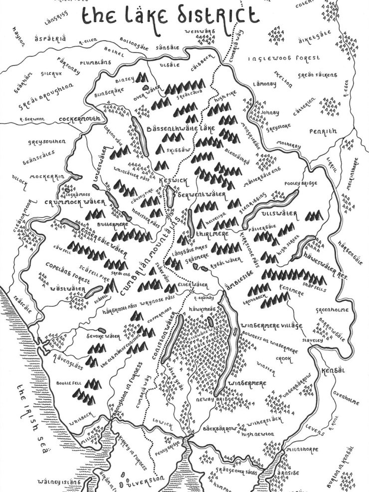
Bell got his cartographic start by drawing fantasy-style maps of his native Lake District and the Yorkshire Dales. He moved on to other national parks, including Yellowstone, and cities, including San Francisco. His maps are spare, hand-drawn, with crisply defined symbols and letters that are almost too straight and well-spaced, and on uncluttered white backgrounds.
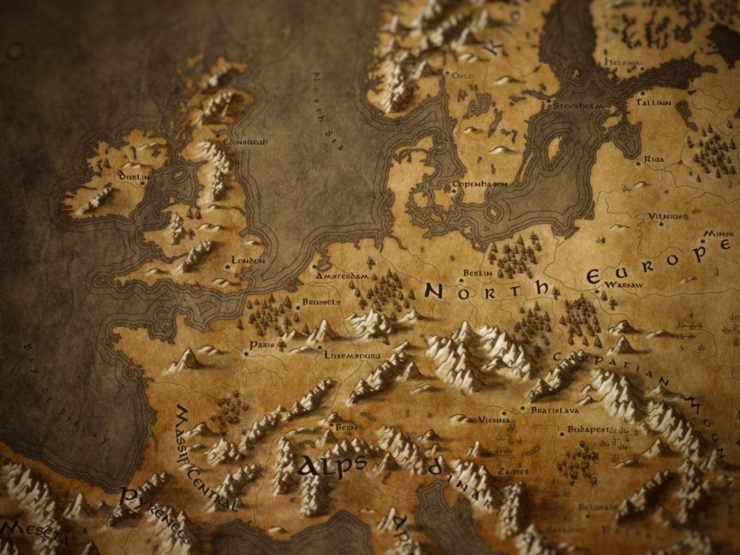
Ogden’s fantasy-style maps, on the other hand, explode with shading, colour and texture; white mountains leap from the screen. These are digital maps, created by Ogden in GIMP from existing digital resources, including a fantasy-style set of Photoshop brushes. (He explains in detail how he makes his maps in two posts on Medium.)
Bell’s and Ogden’s maps are as different as it is possible to be from each other and still recognizably belong to the same artistic tradition. Both explicitly call their maps “Tolkien-style” or cite Middle-earth as their inspiration, and indeed the same could be said of all these fantasy maps of real world places. They aren’t really fantasy map pastiches, they’re Tolkien pastiches.
Ogden’s maps in particular most strongly resemble the maps made for the Lord of the Rings movies rather than the books: his muse is Daniel Reeve, the artist responsible for the movies’ maps, rather than Pauline Baynes or Christopher Tolkien. One tell is his use of Aniron, a fan-made typeface inspired by the lettering used in the films. Generally, if I see a map using Aniron, and especially if Tengwar diacritical marks are applied over the vowels, I know it’s the movie maps that are specifically being mimicked, rather than Baynes or Tolkien fils, or a more generic fantasy map design language. (I see a lot of Aniron in use.)
These maps have a lot of design elements in common: hand-drawn maps, or made to look hand-drawn; lettering that is usually (but not always) done (or made to look as if it’s done) by hand; monochrome or a limited colour palette; a focus on natural features like rivers and mountains. We recognize these elements as fantasy map elements. The question is, are these elements a function of a general fantasy map aesthetic, or are they simply following the aesthetic of Tolkien’s Middle-earth maps? Are they conflating the general with the specific?
For their purposes it doesn’t matter, because they’re in the business of making pretty maps. But if we’re trying to nail down a default fantasy map style, we can’t engage in faulty generalization. Sure, we could say that the default map style is basically Tolkien, and we’d stand a good chance of being right; and we could add maps of Pern, Earthsea, Westeros and the Westlands to our sample, and note the similarities, and we’d probably be right as well. But there’s a lot of fantasy out there, and a lot of maps. It’s possible that fantasy maps are doing the same thing as these artists—imitating Tolkien—but how can anyone make any broad generalizations about fantasy map design without chasing down every single example?
A Quantitative Approach
Enter Stefan Ekman. In his 2013 monograph, Here Be Dragons: Exploring Fantasy Maps and Settings (Wesleyan University Press), the Swedish fantasy scholar tries to answer this question by doing something unexpected in literary criticism: he uses statistics.
I’ve referred to Ekman’s book many times before: I’ve reviewed it, and cited it repeatedly in my own essays and presentations on fantasy maps. And with good reason: there isn’t a lot of scholarly work about fantasy maps out there, fewer still that address the maps’ form in addition to their function. Ekman’s book is about the role of place in fantasy literature (note the subtitle: maps and settings), and the consideration of fantasy maps takes up only one of its four chapters. But that chapter provides us with the data we need.
Ekman surveyed a random sample of 200 fantasy novels. Of those novels, about one third—67 of them—came with a map. About a fifth of the novels had more than one map, so Ekman’s sample came to 92 fantasy maps in total. From those maps, he built up a profile of what elements tend to be found in fantasy maps.
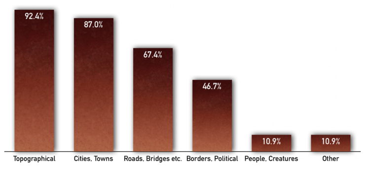
Overwhelmingly the maps contain topographical elements—bodies of water, mountains—and population centres; to a lesser extent they show roads and bridges; political boundaries show up on maybe half the maps. There’s usually no graticule, no indication of a map projection, nor any sense of where the territory fits on a globe, if it even does so at all.
“In brief,” writes Ekman,
a typical fantasy map portrays a secondary world, a compass rose or similar device showing its orientation with north at the top. It is not set in any given hemisphere (not necessarily in a spherical world at all), although there are reasons to believe that clues in the text would indicate north as the direction of colder climates. Apart from topographical map elements such as rivers, bays, islands, and mountains, such a map would also contain towns and other artificial constructions. The hill signs used are typically pre-Enlightenment (either profile or oblique). (p. 66)
Mountains Maketh Map
A lot could be said about the hill signs: the symbols used to indicate mountains. When in profile or oblique, mountains appear not so much as map symbols but as illustrations of the real thing: they encourage us to imagine ourselves, as Padrón argued above, soaring above a fantasy landscape rather than a map. Those oblique and profile hill signs are almost ubiquitous in fantasy maps: two-thirds of Ekman’s sample use one or the other hill sign. (Another quarter of the sample had no mountains at all; other methods of depicting mountains, like contours or shaded relief, were rare.)
They’re so common that it seems like mountains and fantasy maps are inextricable from one another, to the point where I can think of at least one case in which someone saw a map with mountains in profile or oblique and immediately brought them to my attention as a “fantasy-style map.”
‘A Pseudomedieval Aesthetic’
Ekman notes that the hill signs are “pre-Enlightenment”: these are not how mountains are indicated in early modern or modern maps. But neither do they follow medieval practices, which modern audiences would find indecipherable. They look old-fashioned, but actually aren’t, which, Ekman goes on to argue, can be said about fantasy maps in general: they’re mostly modern with “dashes” of older map elements:
Even this brief list reveals the mixture of modern and historical map features. Like much high fantasy, the secondary-world maps follow a pseudomedieval aesthetic according to which dashes of pre-Enlightenment mapping conventions are rather routinely added to a mostly modern creation. Whether this is because of careless research, genre conformity, lack of imagination, or a desire to give the reader the easiest possible access to the map and the world it portrays is hard to say. If the map is meant as an aid for reading (and writing) the story, […] maybe the map should simply challenge the reader’s map conventions as little as possible. (p. 66)
There’s a lot to unpack there. If fantasy maps are an amalgam of modern and pre-modern elements, is it a deliberate attempt to make the map accessible to the modern reader? A way to signal to readers that this is the kind of novel that comes with a map? Or, like our real-world fantasy mapmakers or my aspiring fantasy writer, an act of imitation and conforming to tradition?
These are not mutually exclusive options.
In any event, Ekman has gone some way to answering our question. What does a fantasy map look like? In his (admittedly small) sample of fantasy maps, he found “a genre-wide conventionality” (p. 41). In other words he confirmed, with data, something we intuited: that there is such a thing as a default fantasy map style. “A pseudomedieval aesthetic in which pre-Enlightenment mapping conventions are added to a mostly modern map” is not a bad first attempt at defining it.
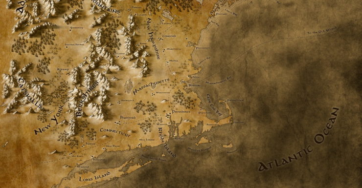
Top image: Detail from “Middle New England in a Lord of the Rings Kind of Style” by Callum Ogden.
Jonathan Crowe blogs about maps at The Map Room. His sf fanzine, Ecdysis, was a two-time Aurora Award finalist. He lives in Shawville, Quebec, with his wife, their three cats, and an uncomfortable number of snakes. He’s on Twitter at @mcwetboy.