


An Unexpected Ode to the New Road House
Comment number:
1


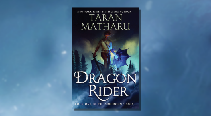
Can an orphan captive learn the secrets of the Dragon Riders to stand up and avenge his people?
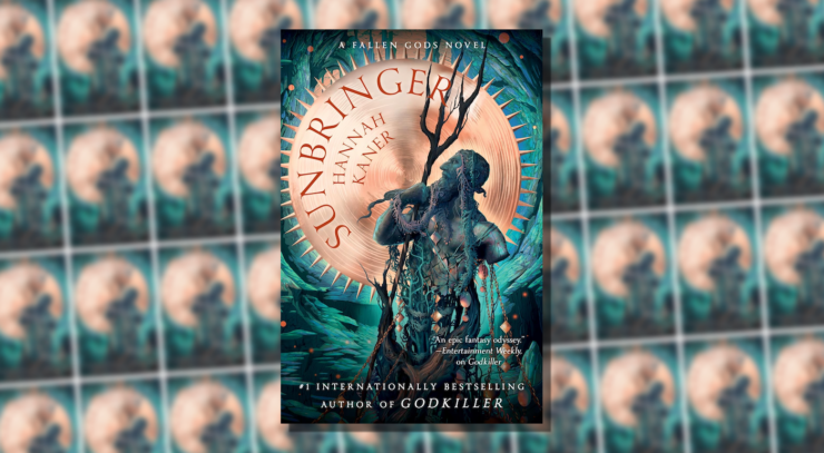
Reviewing the second novel in the Fallen Gods series.

Whether you're pursued by hired thugs, trained assassins, or an unhinged killer, fleeing an atte...
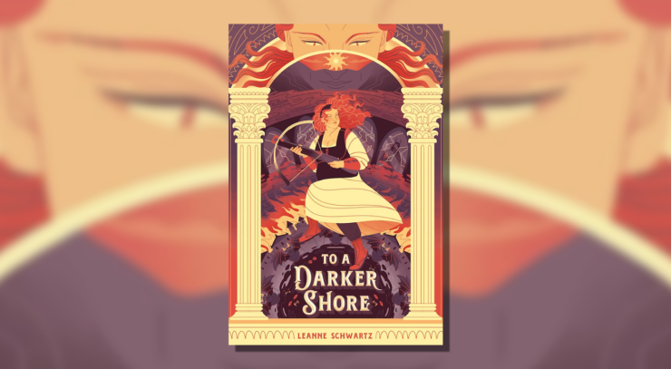
When her best friend is sacrificed to the devil, she’ll go to hell and back for him.
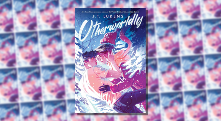
A review of F.T. Lukens' new YA fantasy novel.
How do we decide what’s not normal?

New series installments coming in 2025!

From murder investigations to the mysteries of the universe, these five genre-blending books wil...
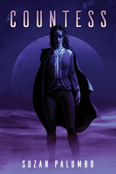
A betrayed captain seeks revenge on the interplanetary empire that subjugated her people for gen...
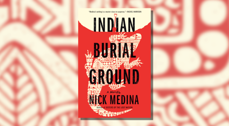
On this reservation, not all is what it seems…
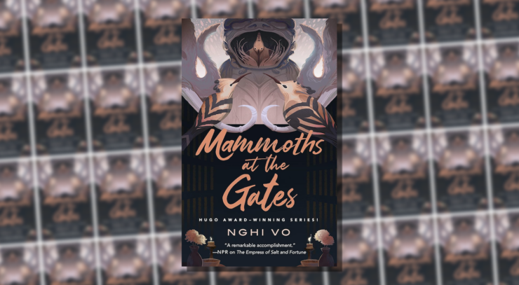
A review of the fourth installment in Nhgi Vo's Singing Hills Cycle.
Rich in psychological complexity, this tale reveals hidden depths as its central tragedy plays o...

Unknown forces attempt to stop Judge Dee and Jonathan from transporting a mysterious and possibl...

A woman visiting Las Vegas for a fun weekend encounters her ne’er-do-well ex-husband, who begs h...
The fourth and final installment of a new serialized novella from Hugo Award-winning author Sara...
The third installment of a new serialized novella from Hugo Award-winning author Sarah Gailey...

The second installment of a new serialized novella from Hugo Award-winning author Sarah Gailey.....
A Brazilian freelance journalist confronts the grim reality her past choices created when she co...

Introducing a new serialized novella from Hugo Award-winning author Sarah Gailey...

In a future where human souls take the form of animal companions, Hairuo struggles to keep her c...