
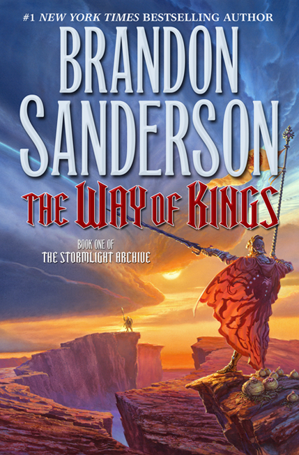
I am very excited to present the cover for The Way of Kings, the beginning of Brandon Sanderson’s new epic-fantasy series, The Stormlight Archive, with artwork by Michael Whelan.
It seems like every part of this project is a major event. Brandon Sanderson, hot off the success of the New York Times bestselling The Gathering Storm, is embarking on a sequence of books every bit as ambitious as The Wheel of Time. In order to match the rich world-building experience of Brandon’s novel, we asked Michael Whelan, arguably the most beloved and influential artist in the field, if he would take on the commission, despite having largely moved away from commercial assignments to focus on his gallery work.
Like the great epic-fantasy writers, Michael never looses sight of the fact that that the environment can be as much a part of the story as the plot and characters. Michael’s worlds are majestic, whether pleasant or imposing, with a depth of field that speaks to the hero’s emotional journey as well as physical. He says,
When I received the manuscript from Tor I was somewhat dismayed. 1400 pages! I felt that it would be tough sledding to work my way through such a massive fantasy epic.
As it turned out, though, I was soon hooked and lost in the world Mr. Sanderson so skillfully realized. It helped that the writing had a rich cinematic quality that brought images of scenes, characters and creatures to my mind as if I were immersed in a Myst-style virtual reality adventure, or watching a movie.
That was fun to read, but it made my work for the cover art very difficult indeed. How can one successfully distill enough of this novel to possibly do justice to the book with one picture? It was a steep challenge.
Michael did not disappoint. The Way of Kings has all the majesty we’ve come to expect in a Whelan painting and promises an otherworldly adventure full of excitement and consequence.
Below the cut, Michael takes us through the cover process.
The sketches.
Michael Whelan: One thing I found very helpful was to have the manuscript delivered to me in a digital format. It was only the second time that I’ve done that, but it was a godsend. To be able to flag and highlight character and scene references, then to search them out and collate information and details, is an invaluable time saver for me.


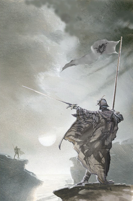
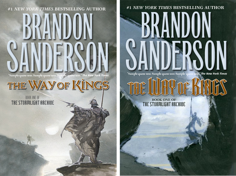
Irene Gallo: I wound up sitting on the sketches for a bit, trying to decide between them. l loved the dramatic value shift and odd composition of the second one but as designer Peter Lutjen began to lay the type in I realized it was not going to work as well as a cover.

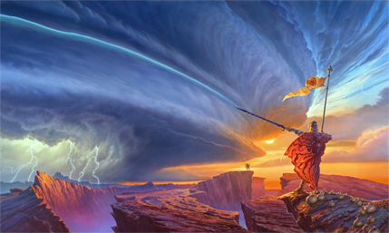
Michael Whelan: I was shown a cover layout for a front cover based on one of my preliminary sketches. But the book was so large in scope that I couldn't restrain myself from widening the field of view, from attempting to capture some of the vast scale of the world described so well in the book. While reading The Way of Kings it becomes clear that the planet of the story is itself a character, perhaps the prime character, of the narrative, so I felt it was essential to portray one of the massive storms described in the book. I could only do that using a horizontal format with a panoramic view.
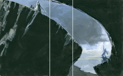
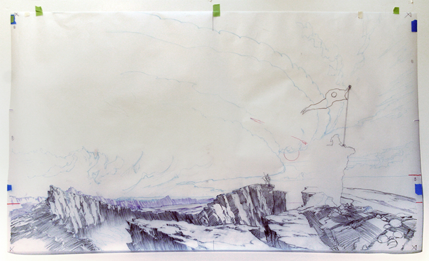
The first thing I did was to draw out some of the larger landscape shapes, get the placement of the various elements worked out on tracing paper:

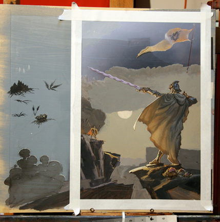
I often do a study or two of the main characters, which then become my “models” while I am doing the actual painting. This is a painted sketch of the figures and some tentative plant forms.

After transferring the landscape masses to the panel I painted in the cloud shapes using pastels, which I then fixed by spraying down with clear acrylic gesso.The panel is cradled in a bed of foam board, which has registration marks so I can accurately fix my drawings on tracing paper if I need to check on the painting’s fidelity to the original composition.

Usually I work from background to foreground, and from shadows to light, but in this case I needed the foremost figure in there to guide my handling of the sky elements framing the figure. Also, from fairly early on I had the glow of the veiled sun indicated to guide my color and values in that part of the sky.

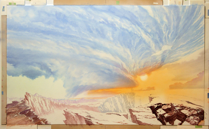
By this time the sky is pretty well laid in, and I’ve started to lay the shadows into the landscape masses.
As often happens, I decided I had incorrectly visualized the shadows and structure of some of the landscape shapes and had to fix them as I painted them in.
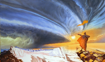
The final:

Irene Gallo is the art director for Tor Books and Tor.com.
Monday March 01, 2010 12:11pm EST
Monday March 01, 2010 12:22pm EST
Monday March 01, 2010 12:24pm EST
VIEW ALL BY · Monday March 01, 2010 12:25pm EST
Monday March 01, 2010 12:29pm EST
VIEW ALL BY · Monday March 01, 2010 12:38pm EST
VIEW ALL BY · Monday March 01, 2010 12:45pm EST
VIEW ALL BY · Monday March 01, 2010 12:55pm EST
Monday March 01, 2010 01:15pm EST
VIEW ALL BY · Monday March 01, 2010 01:28pm EST · amended on Monday March 01, 2010 01:29pm EST
This cover also brings up one of my pet peeves with book covers... I hate book covers that have the author's name in a larger font than the book's title. I know it's probably some sort of industry standard for big-name authors, but that doesn't mean I can't gripe about it :)
VIEW ALL BY · Monday March 01, 2010 01:35pm EST
VIEW ALL BY · Monday March 01, 2010 01:36pm EST
Monday March 01, 2010 01:51pm EST
Also, third paragraph "looses" should be "loses"
Monday March 01, 2010 01:56pm EST
VIEW ALL BY · Monday March 01, 2010 01:59pm EST
VIEW ALL BY · Monday March 01, 2010 02:02pm EST
Tor must be ecstatic to have their hands on talent the likes of Michael Whelan and Brandon Sanderson. The NYT might as well prepare that space at the top of the list now, this work is going to hit like a bulldozer.
Monday March 01, 2010 02:12pm EST
VIEW ALL BY · Monday March 01, 2010 02:16pm EST
Monday March 01, 2010 02:49pm EST
Monday March 01, 2010 03:36pm EST
When used for the cover, the greyscale version of the artwork catches my eye and draws me in a lot more than the full-color does.
Monday March 01, 2010 03:45pm EST
VIEW ALL BY · Monday March 01, 2010 04:02pm EST
Having a Whelan cover is literally a dream come true for author and editor alike. The combination of his innate artistic genius and the meticulous attention to detail shown above produce results that are unsurpassed in their ability to evoke a world previously only realized in the mind's eye of the author.
I'm eager for you all to enjoy the story that goes with the picture. We're working hard to get it to you this summer, even as Brandon continues his work on the Wheel of Time.
VIEW ALL BY · Monday March 01, 2010 05:26pm EST
I can still envisage every one of MW's John Carter of Mars covers. And the Ivrel ones. And- heck, he useta be all over the place!
VIEW ALL BY · Monday March 01, 2010 05:54pm EST
He should do the covers for every Fantasy book ever.
Monday March 01, 2010 06:33pm EST
VIEW ALL BY · Monday March 01, 2010 07:26pm EST
Now seeing his work dressing a new book by someone who's swiftly become one of my favorite authors just about makes my head explode. I will happily buy this in hardcover, almost as much for the art as for the book itself.
(argh, August? *sigh*).
Monday March 01, 2010 08:20pm EST
Monday March 01, 2010 08:49pm EST
VIEW ALL BY · Monday March 01, 2010 08:54pm EST
Anyway, here's Brandon's comments on this. I'm pretty sure all the reviews are just fans who decided to be smart alecks. :)
http://www.brandonsanderson.com/blog/567/The-Way-of-Kings-on-Amazon-%28%29
VIEW ALL BY · Tuesday March 02, 2010 12:54am EST
VIEW ALL BY · Tuesday March 02, 2010 02:06am EST
Not that I don't agree with you but it's a branding thing. When people go to the bookstores, they will know Sanderson's name before a title so, the idea is to make that more visible. And, as you say, it's become a bit of industry-code for "Important!".
@26 Talia:
Well, we'll get to see at least one more cover from Michael. He had actually agreed to work on a Venor Vinge book before the Sanderson manuscript came up but he Vinge book was scheduled much later so we were are to fit both in. I'm very much looking forward to seeing how that turns out as well.
-----
As an aside note: Michael was up at Boskone this year. It was great to be able to hang out with him a bit but I think the thing that excited him the most was seeing a guy in armor with the perfect helmet reference for this image. He said that he had been struggling with that part of the painting before he drove up and now he seemed _really_ excited to get back to the studio with whatever issues that were plaguing him figured out. That is a pro. Someone that has been painting as long and as well as he has and he's still inspired by the prefect shape, or bit of reflected light.
VIEW ALL BY · Tuesday March 02, 2010 07:15am EST
Having read 'the Gathering Storm', I have confidence in Brandon's ability to write 'epic fantasy'. I'm looking forward to the book.
When will it be released??
VIEW ALL BY · Tuesday March 02, 2010 10:43am EST
Tuesday March 02, 2010 08:42pm EST
Tuesday March 02, 2010 09:02pm EST
I agree with you. I think that the way the cover is set up distracts from the power and beauty of Michael's storm. But the art itself is amazing.
Wednesday March 03, 2010 02:34am EST
(I'm a big fan of matching covers for books in a series, it really bugs me when a drastic cover change is made half way though!)
Although, it would be kind of cool to get a different awesome artist to do the covers for each book!
Wednesday March 03, 2010 02:52am EST
Thursday March 04, 2010 12:29am EST
I totally need a print version and a desktop wallpaper of that.
Thursday March 04, 2010 05:30pm EST
--Duncan Long
=====================
Freelance illustrator for HarperCollins, PS Publishing, Pocket Books, Solomon Press, Ballistic Publishing, Asimov's, etc. See my cover illustrations at: http://DuncanLong.com/art.html
.
Thursday March 04, 2010 06:07pm EST
I agree with JoelRight about the compromising of the cover image with 40% being obscured by the author's name. It may be a branding thing in the industry but it really hurts this image a great deal. It needs air to showcase the depth and detail Whelan has worked so hard on and all that type covering 50% of the available area is just onerous. And does Brandon Sanderson really deserve this kind of treatment?
Having gotten that off my chest, let me say how much I LOVE these articles. Getting to read about the decisions made by you on cover specs, the considerations for different layouts, the comments shared by the artist, this is GREAT STUFF! Thank you! You are the reason I keep coming back to Tor.com.
Thursday March 04, 2010 06:16pm EST
I want to suggest marketing numbered prints signed by Michael Whelan with a copy of the book signed by Brandon Sanderson, but I don't know if I could afford it.
Prints would be really nice though.
Saturday March 06, 2010 12:17am EST
Wednesday March 10, 2010 12:00pm EST
VIEW ALL BY · Sunday March 14, 2010 02:34pm EDT
Ask that question again in two years. There is no doubt that Michael Whelan is the premier fantasy artist at work today, but let's keep cart and horse in proper perspective. The book wasn't written as a canvas for Whelan's art. Tor is backing a winning horse in Brandon Sanderson, and if you haven't read his work, you should consider it. He is as original a fantasy author as I've ever experienced, and his vision for The Stormlight Archive is incredible in its depth and scope.