Part two of our review of the covers of the 2008 Hugo nominees, in which we’re not as gushing with our praise as we were yesterday. Part one is here.
Halting State by Charles Stross
(US: Ace; UK: Orbit)
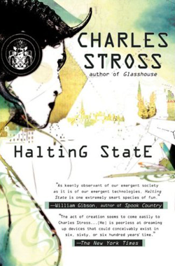
U.S. Edition cover illustration by Sophie Toulouse, designer unknown.
U.K. Edition cover illustrations by Army of Trolls, design by Sean Garrehy.
A near-future techno-thriller, involving a bank heist within an MMORPG (Massively Multiplayer Online Role Playing Game).
This cover is not particularly bad, but it’s not great, either. While the illustration by Toulouse is eye-catching, it is hardly this illustrator’s best work. I actually like her work a lot, I just don’t think she’s particularly suited for this type of project--check out her agent’s website for some really cool fashion, editorial, and advertising work. Regardless, the illustration used here says very little about the actual premise of the book directly, other than that it’s set in Edinburgh (and that’s only if you’re very familiar with that city’s skyline). The woman depicted in the illustration is wearing some sort of headgear which has a cyberpunk or possibly even slightly steampunk feel to it (note the crest on her ‘headphones’), but it’s vague, and doesn’t come across as one or the other, adding to the ambiguity of the piece. On the other hand, having read the novel (and enjoyed the hell out of it), I do think the artwork somewhat captures the general tone of the novel. It certainly gives one the feeling of a drab world made slightly richer through the use of technology, particularly the layers of information laid over real-world scenes used by the various enforcement agencies depicted in the novel.
The cover sports a spot gloss effect over most of the non-white areas of the layout, giving the illustration and type a nice shine in contrast to the matte-coated white areas. This, along with embossing for the title and author, give the cover a pleasing tactile quality, while reinforcing the concept of information overlays which I mention above.
The typographical treatment is somewhat underwhelming: it’s not very expressive, and there isn’t much variation in size or treatment. The strange capitalization scheme for the title I imagine alludes to the phrase ‘halting state’, which, in programming, refers to a point in an instruction set at which a computing process stops (I am not a programmer, so please correct me if I’m wrong). By placing a capital letter at the end of a word, the designer is making it harder for the reader to ParsE ThE TitlE of ThE BooK in OnE FluiD TakE, thereby forcing the reader into their own kind of halting state. Unfortunately, the typeface is so clean and readable to begin with, and the title so short, that the effect isn’t as marked as it would otherwise be.
Also unfortunate is the large block of text for the cover blurbs. While cover blurbs are very important, and certainly drive sales, I think this is a case of overkill. The overall cover design would have been better served by keeping one blurb on the front (perhaps the Gibson), and leaving space for a more aggressive and interesting title treatment, instead of having a big block of text that is by far the densest element of the layout, and tends to weigh the whole composition down.
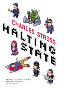
This U.K. version by Orbit is the complete polar opposite of the U.S. cover in some ways. While this approach nails the contents of the novel (theft and murder within the context of a video game), its whimsical approach is hardly appropriate for the tone of the book. It feels more like a modern-day comedy, or a light-hearted adventure, than a near future techno-thriller.
Once again, thanks to Jamie Stafford-Hill for additional material.
VIEW ALL BY · Tuesday August 05, 2008 08:29am EDT
If it misfires, it's because the eight-bit video-game imagery is all from a couple of decades ago--it's a middle-aged hipster's notion of what a "video game" looks like, completely unlike the visuals of present and near-future MMORPGs. On the other hand, on the general principle that the job of an SF cover package is not to literally illustrate the story but rather to tell us what the book is going to feel like to read, the UK Halting State cover is in fact successful--the message it gets across is "high-tech, stylish, and bloody-minded," which is a pretty good set of associations for anything by Charles Stross.
VIEW ALL BY · Tuesday August 05, 2008 08:45am EDT
Pablo, are you responding primarily or more strongly to design elements? It's interesting to see how designers, illustrators ans authors all respond differently to these covers. I respond to this cover more favorably than I did to the Chabon book, perhaps because I look for a naturalistic portrayal of narrative, or a suggested narrative.
Tuesday August 05, 2008 09:41am EDT
Yes, indeed! And also - in these times of congested shelves in the bookstores - to make the book stand out from the crowd and to entice potential readers to pick it up, both of which I think we've done. And if you'll permit me a small plug, we've endeavoured to take the "stylish" element even further with the mass market cover:
A higher res version can be found here. Great set of posts, by the way. It's fascinating to see the different cover approaches on each side of the Atlantic - and also the reactions they provoke from readers.
Thanks for the opportunity to post my two bits' worth.
Tuesday August 05, 2008 09:42am EDT
I like the UK cover, especially the back page.
VIEW ALL BY · Tuesday August 05, 2008 10:40am EDT
Eric--The comparison to the Copland covers has been mentioned elsewhere, but I decided to stay away from mentioning it here, as I'm keeping my discussion of the UK covers brief.
I like the illustrator, and I think I'd like this piece on its own, I just don't think it's the best solution for this particular book. However, you're right: my strongest negative response to the design is mainly the typographic treatment.
Darren--Welcome, and thanks so much for the link to the mass market cover! It's so great to hear from the creative team behind a piece. I'm glad you're enjoying the posts.
Quick request, if you come back to follow up on this thread: Can you supply me with the appropriate credits for the UK cover design (is it you, or another member of your team, a separate illustrator)? I like giving credit where it's due....
Anthony--I've heard...rumblings about the process leading up to the final cover, but since all I'm privy to is the final product, that's what I've limited myself to talking about. Were you involved in the process?
VIEW ALL BY · Tuesday August 05, 2008 10:46am EDT
I've had a glimpse at some of the artist's other work and agree with Pablo, that it is better suited for editorial publications.
Tuesday August 05, 2008 11:27am EDT
My pleasure. The pixel illustrations are by Army of Trolls @ NB Illustrations, and the design work is by one of Little, Brown's inhouse designers, Sean Garrehy.
VIEW ALL BY · Tuesday August 05, 2008 11:33am EDT
VIEW ALL BY · Tuesday August 05, 2008 11:52am EDT
When I saw Halting State on the shelf, the book was face out and I wondered who on earth would publish such an ugly book. In addition, the position of Gibson's blurb made me wonder if he wasn't a co-author.
(Feel free to call me an idiot on that second point. I mean it's obviously a blurb. What can I say, except that this was my first impression.)
So, I picked up the book and checked out the jacket notes. I'm a Rebus fan so anything set in Edinburgh automatically ends up on the list. Glad I did too, Halting State is awesome.
Anyway, as I noted above, an unusual number of people asked me about the book and several went on to buy it. To me, this means the cover did its job - ugly or not. :)
VIEW ALL BY · Tuesday August 05, 2008 12:14pm EDT
The original version of that cover design badly confused London and Edinburgh.
VIEW ALL BY · Tuesday August 05, 2008 12:47pm EDT
Irn-Bru though is responsible for one of my absolute favourite ads of all time (Christmas! The Falkirk Wheel! The Forth Bridge! The Monarch of the Glen! Small child plummets thousands of feet and then lands on ground with a splat!) You do need to be familiar with the animated version of Raymond Briggs' Snowman. Luckily, 100% of the UK population is, so that's ok.
VIEW ALL BY · Tuesday August 05, 2008 12:47pm EDT
VIEW ALL BY · Tuesday August 05, 2008 01:38pm EDT
Well I didn't find it laugh-out funny but there was more than a touch of humour throughout the book. More than enough that a straight techno-thriller style cover could shade into not capturing the feel of the writing.
I would say that the graphics on the UK cover are purposefully retro. For me they resonate a little with the writing (and not the content) as they feel almost from the same era as text adventures.
However I do own the US edition (it was published first). About the only thing I really like about the US cover is the typography on the title. The cover blurbs are particularly horrible.
VIEW ALL BY · Tuesday August 05, 2008 02:14pm EDT
U.K. Cover: I totally dig this cover. There was a lot of humor in the book, though it was hardly a comedy, so the "cutesy" 8-bit seems fine to me. There were times I laughed so hard I had to put the book down (something about juggling Elder Gods, stands out in my memory). Also the cover has a vague noir leaning in the imagery that seems not inappropriate. The slightly off-kilter addition of the orc is also in keeping with the way the "orcs" in game are problematic and confusing. All in all, it works for this reader.
VIEW ALL BY · Tuesday August 05, 2008 02:37pm EDT
Not that I wouldn't have recognized Charlie Stross's name---just saying in general when I see special cover treatments I know that someone believes this books is going to sell well.
The artwork itself tends to call the eye down towards the cover blurbs --- while I think the Gibson blurb carries weight with SFF enthusiasts I'm not to sure about the NYT blurb as far as weight consideration for hardcore SFF fans.
"You! NYT blurb...back of the jacket!"
I'm thinking the NYT blurbs are generally included for snagging mainstream market potential?
Either way I find the blurbs distracting from the
I think the cover art is too eccentric anyway for mainstream cross-over --- and any mainstream reader popping it open and seeing second person POV ...well, their head would probably explode.
The typographical treatment of HaltinG StatE may have been an attempt at expressing L33t-sp34k without 47I3N4TInG everyone. Leet is commonly used in MMOs. It could also be the artist was familiar with BBSs when leet-speak was just emerging as a SimPLE AnD AlMoSt RanDoM hit of the shift-key.
VIEW ALL BY · Tuesday August 05, 2008 04:26pm EDT
VIEW ALL BY · Tuesday August 05, 2008 08:04pm EDT
Eithin @216,
It worked for me. It's only one tit & not in a sexualised way (unlike the cover for "Saturn's Children"). It conveyed the vibe of the book, I thought - vaguely futuristic/menacing.
Not sure about the capitalization scheme of the title though. The letters in caps are 'HGSE'. Is it some sort of secret acronym?
Hugo Grade Strossian Extrusions?
VIEW ALL BY · Tuesday August 05, 2008 09:51pm EDT
The thing that actually irritates me the most about the US one is the near-tangent between the hair and the C. Illustration style preferences are subjective, but tangents and near-tangents send my design sense up a wall.
Of the two, I'd be more likely to pick up the UK book.
Wednesday August 06, 2008 02:46am EDT
VIEW ALL BY · Wednesday August 06, 2008 12:42pm EDT
On the other hand, Halting State is blatantly based on World of Warcraft, which has a very different graphical style indeed - but basing an SF book cover on a takeoff of that would make it look like a WoW novel to those who recognized it, and yet more extruded fantasy product to those who didn't. The WoW aesthetic is a lot more like the Pixar-esque US cover of Saturn's Children.
VIEW ALL BY · Wednesday August 06, 2008 04:20pm EDT
I remain an unrequited Strossian purchaser to this very day.
VIEW ALL BY · Wednesday August 06, 2008 04:53pm EDT
Ni modo, ¡Amazon contígo!
VIEW ALL BY · Wednesday August 06, 2008 10:29pm EDT
I loved everything about yesterday's cover - more the longer I looked at it. This one leaves me completely cold.