


Part three of our review of the covers for the 2008 Hugo nominees, after which we’re rubbing our eyes and squinting very much. Part one is here, and part two is here.
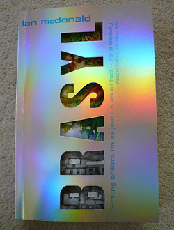
Brasyl by Ian McDonald (US: Pyr; UK: Gollancz)
U.S. Edition Design by Jacqueline Cooke, illustration by Stephan Martiniere
U.K. Edition Design by Dominic Harman.
The synopsis this time comes directly from the author, via Pyr-o-mania: “My book Brasyl is set in present-day Brazil (or what seems like it), in Sao Paulo 2032, and in 1732 Brazil just before the Jesuits were expelled. It revolves around the way quantum computing opens up multiple parallel universes… and, of course, a whole lot more besides.”
The design for this book is straightforward and simple, featuring a classic layout: the cover is split into thirds, with the title and author taking up the top third. The lower two-thrids of the cover are given over to a stunning Stephan Martiniere illustration depicting a future city scene. This is clearly a case where the illustrator was hired to do what he does best (or one of the many things he does best—Martiniere is everywhere!): beautiful, compelling, and engaging future or fantastic city scenes. This is clearly a city in Brazil: sex for sale, palm trees, and a smattering of Portuguese text here or there; but thrust into a neon, fast-paced, always-on-and-always-open near future. The composition of the illustration takes into consideration the needs of a book cover: lots of space with a uniform value (or, the lightness or darkness of a color) around the top and bottom, which makes it easy for a designer to lay in type on top of it; a clearly defined focal point, and lots of little details (or ‘sprinkles’, as an old art school acquaintance of mine used to say) to draw you into the painting and keep your attention firmly in its grasp.
The neon/florescent color scheme for both the painting and the type certainly communicates a sense of electric vibration, which ties in nicely with the concept of quantum computing (and certainly reminds us of Terry Gilliam’s film by the same name). Perhaps florescent or otherwise special inks were used in printing—the final effect is blindingly intense. Overlaying three instances of the title, off-register with each other and in three different neon colors adds to this vibration. It also complements the bustle depicted in the street scene nicely. Additionally, the three instances of the title relate conceptually to the three-story structure of the novel. While the choice of typefaces is somewhat orthodox, and could be perceived as boring under other circumstances, I think it works in this case: anything more complicated or ornate for the title would have rendered it much harder to read, when coupled with the three-instance treatment; and the simplicity and directness of the sans-serif typeface used for the author’s name serves as a nice contrast to the busy, hectic feel of the title proper. It also adds a solid, light-valued area to the top of the composition, which helps balance out the lightest areas of the illustration towards the bottom, and tie the composition together a little better.
 The U.K. trade paperback is also a strong showing. What it may give up in conceptual relevance to the novel it makes up for in terms of presence. Most of this is due to the die-cut, iridescent cover which opens to reveal a lively mash-up of a colorful illustration and images of a Brazilian favela (or slum), with cover blurbs on the inside front cover. Between the odd spelling for ‘Brasyl’, the big, blocky sans-serif type, and the iridescent cover, I can see this book positively popping off the shelves when face out.
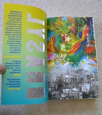
Yet again, thanks to Jamie Stafford-Hill for the helping hand with these first posts.
The images of the U.K. cover are courtesy of James Bloomer, via his blog, Big Dumb Object.
Tomorrow I’ll post Rollback, by Robert J. Sawyer. As it’s a Tor book, I won’t be reviewing this one, instead I’ll be relying on you guys to give us some juicy feedback. If you’d like to submit a review for this book’s cover, or for The Last Colony, by John Scalzi, check out the rules of the game, and drop me a line at pablo dot defendini at tor dot com.