


We’re pleased to reveal the trade paperback covers for Lavie Tidhar’s The Bookman trilogy—a steampunk series rife with Lizard Kings and swashbuckling pirates, secret government agencies and scuttling automata, tripods and airships. These new editions of The Bookman, Camera Obscura, and The Great Game will be published by Angry Robot in summer 2016. Check out all three covers below, as artist Sarah Anne Langton shares her process and explains how she fought the impulse to overload the covers with to much cool stuff.
* * *
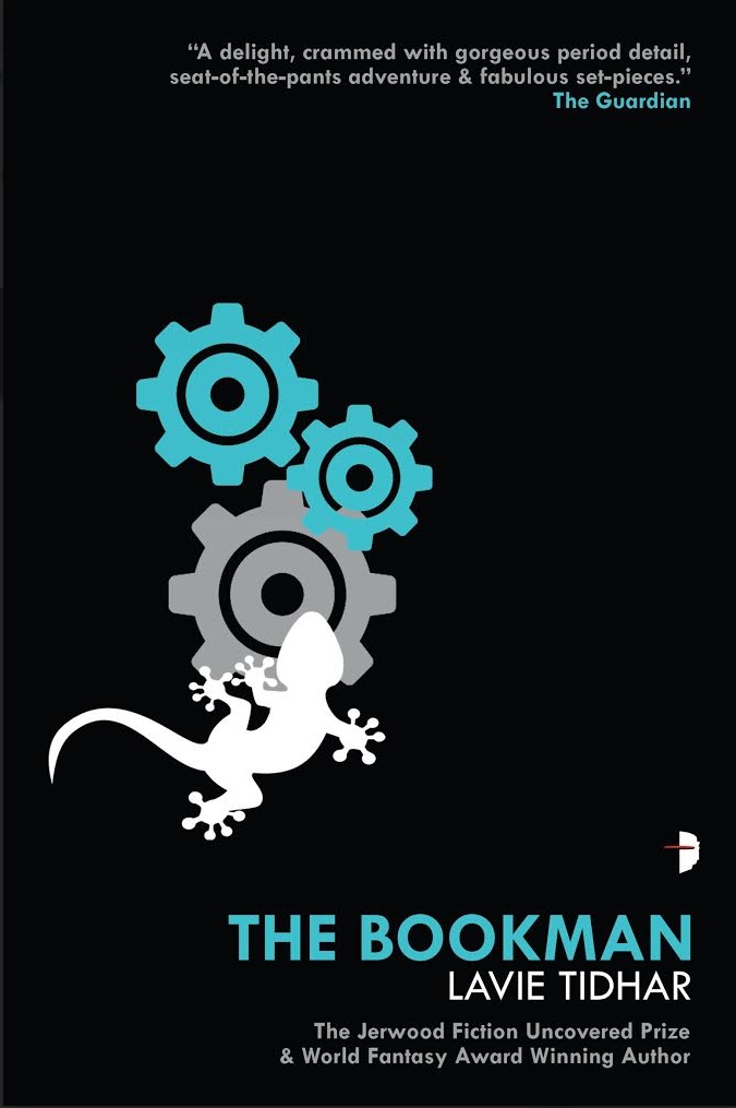
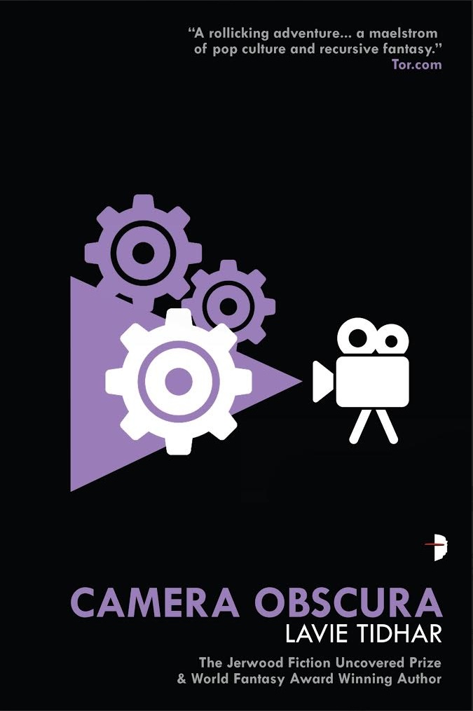
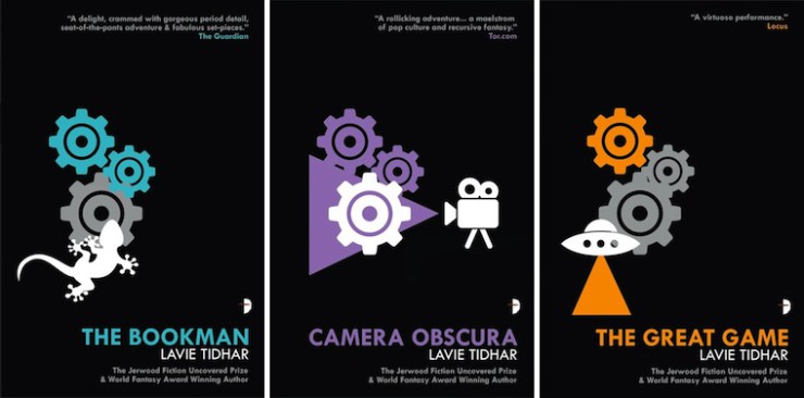
There’s a problem illustrating The Bookman trilogy. The problem with illustrating the The Bookman trilogy? Well, there’s actually way too much good stuff in there. Space probes, giant lizards, secret government agencies, tripods and airships, all set in a crazy, alternate Victorian Britain. That’s artistic catnip for me and it was really difficult not to go on a wild artistic binge. But the brief was “minimal, cool an’ classy,” so, despite the vast amount of fun stuff to work with, keeping the pixels to a minimum was in order. And, erm… probably for the best before everything ended up with like thousand of zeppelins on it!
I really wanted the books to visually look like a set: unmistakably by the same author and unmistakably set in the same world. I’m a big fan of Jamie Reid-ish, post-punk “neon colours on black”—shouty graphics!—and I wanted to use that sort of idea with a key visual element to repeat over all three covers. These books are Lavie’s own unique brand of steampunk but if you can boil the genre down to a single, iconic image, for me it’s always “clockwork.” But, as it’s Mr. Tidhar’s own brand of steampunk here, I decided to go with an illustrative feel that didn’t look exactly like the usual reproduction of 19th century stylings that the genre normally uses.
Once the cogs were happily down in Photoshop, Lavie gave me a selection of “visual linchpins” for each novel. Something I could design into a neat little icon to try to sum up the title with one simple graphic message. At this point a lot of things went into the trash, but eventually we boiled it down to lizards, camera obscura, and flying saucer/tripod. My tripod illustration kinda looked… erm, wildly unstable and non-menacing so had to head for the bin too—top art direction skills from Lavie here! But I really like playing with “how minimal can we get this but still retain the message” graphics so lizards became singular, legs were lopped off things and cogs mysteriously disappeared. Three books, three cogs and as each of the Bookman Histories also works in its own right, each design gets to have it’s own color. And as some of the time that novel is only going to be seen end on, I took the little icon design round onto the spine as well.
I love trying to illustrate covers that’ll jump off the shelf at readers, “Can you spot that from thirty paces?” stuff that doesn’t look very much like anything else in the science fiction and fantasy department. If it’s a great book, the cover should do it justice and stand up in its own right wherever that novel gets placed in the store. Hopefully these designs do just that, giving you just a hint of “Well, what exactly is this weird and wonderful looking title about?” and making folk curious enough to go take a look. Which I can honestly say they won’t regret!

Sarah Anne Langton has worked as an Illustrator for EA Games, Hodder & Stoughton, Forbidden Planet, The Cartoon Network, Sony, Apple, Marvel Comics and a wide variety of music events. Her work has featured on io9, Clutter Magazine, Forbidden Planet, Laughing Squid and Creative Review.