


Julie Dillon. Twice nominated for a Hugo Award for Best Artist, she’s become synonymous with awards ballots. The Chesley Award, Spectrum, and the World Fantasy Award, among others, have all named her as one of the finest illustrators working in science fiction and fantasy art.
Oddly, she remains under used in the cover game, with only a handful to her credit among major publishing houses. And among cover artists, her name recognition in comparison to stalwarts like John Harris and Michael Whelan lags behind, which is a fact not long for this world. Because Julie Dillon has something few artists lay claim to, a distinctive point of view.
I mention that last sentence in particular because point of view is what separates someone who create beautiful pictures from someone who can create beautiful pictures to suit a particularly project. Whether it’s a video game, or concept art, or Magic the Gathering Cards, or book covers, art directors don’t hire based on talent alone. They hire an artist because their unique style communicates the same tonal qualities as the underlying intellectual property. Less convoluted version: an artist’s style drives the boat as much, or more so, than in how technically proficient they may or may not be. Chris McGrath graces two covers every month (seemingly) not because he’s the greatest artist who ever walked the Earth, but because no one says gritty and intense better than him. What then is Julie Dillon’s calling card?
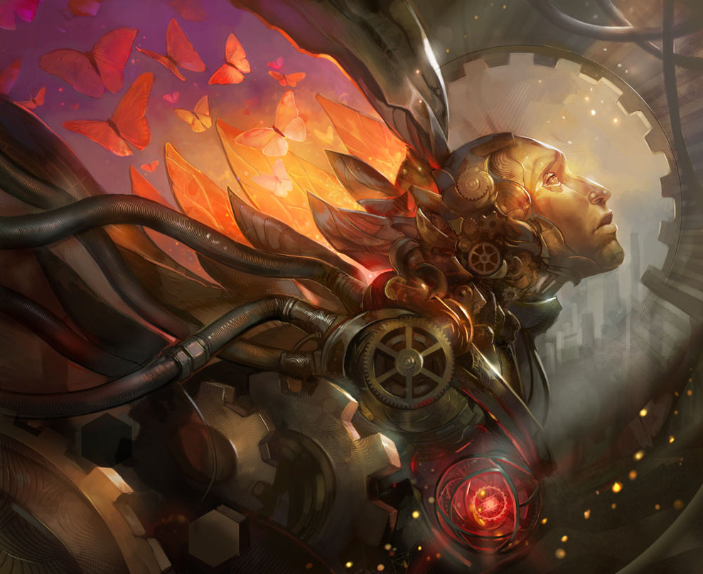
I would argue her flag is planted in two places. The first is color—intentional, declarative, and purposeful color. One of my absolute favorite pieces of hers is “Artificial Dreams” from 2010. So many artists would go for the more grimy portrayal, the grease from the gears, with the focus on a dirt smudged face. The butterflies, in hues of red and orange make a statement. The bright red heart, with hints of orange to pull it together, in conjunction speaks more about the energy of engines or clockwork than any cogs could accomplish.
The other trait I associate with her art is that it’s never about a single element. Where Daniel Dos Santos and Karla Ortiz focus on figures, Dillon’s work always seems to stretch itself as a total composition from end to end. Here in “Space Sirens,” the image can be cut into quadrants and still be interesting and relevant to the larger story the art conveys.
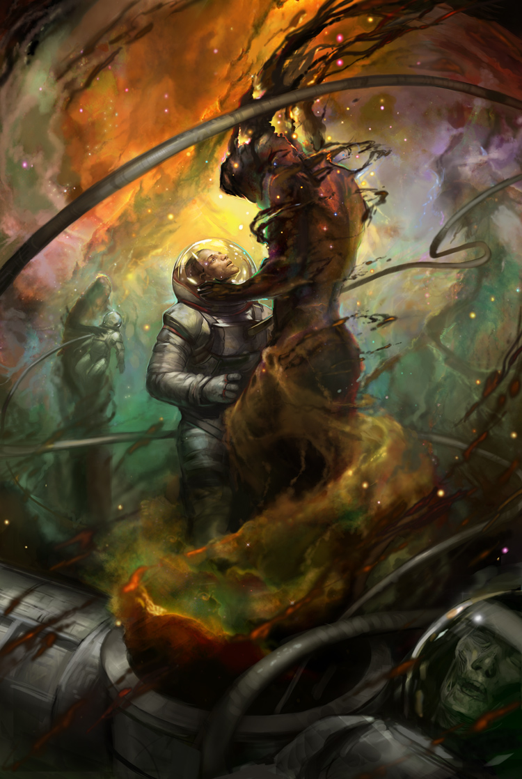
From the desiccated corpse at the bottom, to the second astronaut and siren fuzzed into the background, and the swirling nebula cloud behind it all, the image works as a cohesive piece, focusing on mood above portraying an accurate scene. This is what the best artists accomplish, something Jeffrey Alan Love, Victo Ngai, and Kinuko Y. Craft have mastered. Certainly not as surreal as Love, or as detailed as Ngai and Craft, Dillon seems to straddle the line between clarity and emotion in a way that’s too rarely seen.
In truth, the science fiction and fantasy cover scene has been inundated with clarity for a generation. Artists like Todd Lockwood, Stephan Martiniere, Lauren Saint-Onge, Jason Chan, Cynthia Sheppard, Julie Bell, Bob Eggleton, and many of the aforementioned artists seem to have grown out of a time where fantasy art needed to bring these made up creations to life. Rather than kindle emotion, they seem designed to evoke a sense of wonder. I suspect it has a lot to do with the art of Dungeons and Dragons, via TSR, Inc. and later Wizards of the Coast. It is also certainly a response to the cheesy films of the 1970s and 80s that made fantasy and science fiction seem campy, a silly joke of made up realities. One look at the artists I mention above and the notion of a dragon as camp becomes moot. But, Dillon, like John Picacio and Donato Giancola embraces that sense of concrete imagery without becoming literal.
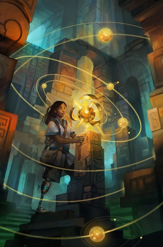
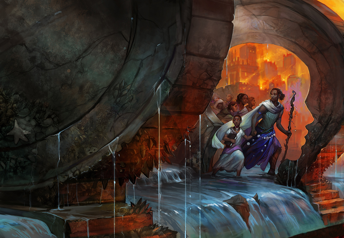
Looking at these two technical aspects of Dillon’s style misses what is perhaps her biggest calling card. Her art makes an earnest effort to portray people, settings, and cultures outside of the standard western norm. Such a thing may not seem significant since so many commissioned pieces are driven by the content. For example, it’s hard to make Rand al’ Thor anything other than a white guy. But so much of Dillon’s work contains people and places outside the default norm. Her commitment to drawing this robust view of the world encourages, nay inspires, others to do the same. It begins to create a culture within the science fiction and fantasy art community that says this can be beautiful, this can move people, this can sell books.
To see the things I’m talking about in action, look no further than Dillon’s recently announced Kickstarter funding an annual art book, Imagined Realms. Or, visit her website for her complete portfolio. I think what excites most of all about Julie Dillon can be seen there. From 2005 to 2014 she has demonstrated incredible growth. Her art is just keeps getting better. It keeps saying more exciting things. I’m really excited to see what it says next year and ten years down the road.
Justin Landon runs Staffer’s Book Review where his posts are less on-color. Find him on Twitter for meanderings on science fiction and fantasy, and to argue with him about whatever you just read.