


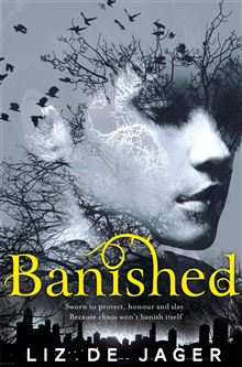
It’s so exciting as an author when you are asked to contribute to the cover art briefing process for your book. So much rides on the cover and of course I wanted to give all the help I could for Banished, my debut novel. Also, I was really impressed at how early these discussions took place—we were talking about cover art almost before we spoke about edits and I felt flattered that Bella wanted to include me in the process.
Bella asked me to supply detailed descriptions of the characters, including what they wore and how they moved. She was also interested in any images I could provide which might give an idea of where the book took place, the weapons they’d use etc. She also asked me to think about the book as a whole and to let her know if there was any imagery I thought stood out particularly.
As I’ve been living in the Blackhart world for such a long time, and because I knew the characters so well, it was tempting to bury them with descriptions! Instead I prepared a short write-up about what Kit looked like and how she dressed, including the weapons she’d use. There were reasons why Kit’s hair had to be short—it’s easier in a fight, as less likely to get caught on weapons or be used against her i.e. grabbed and pulled. She also wore very little jewelry, if any (too likely to get caught on clothing or, if it’s earrings, to be ripped out in a fight) and her clothing would be practical. I was thinking jeans, hoodies, t-shirts, shorts, combat boots or worker’s boots and trainers. It’s not a glamorous life being a Blackhart and there was no cause for her to be swanking around in high heels and evening dresses. I’ve had to run in high heels before—it’s hard. Admittedly you could use a stiletto heel as a weapon but it’s not ideal.
I’d been introduced to Pinterest a few years ago and I’d fallen in love with the site. For this reason, I already had masses of stuff pinned on there that I’d already used as inspiration. So when Bella mentioned the cover art briefing, I knew that I’d have to show her and her design team what I had stashed there. I created a separate private board for Bella to access and on here I uploaded cover artwork I’d loved—from other urban fantasy titles and YA books especially.
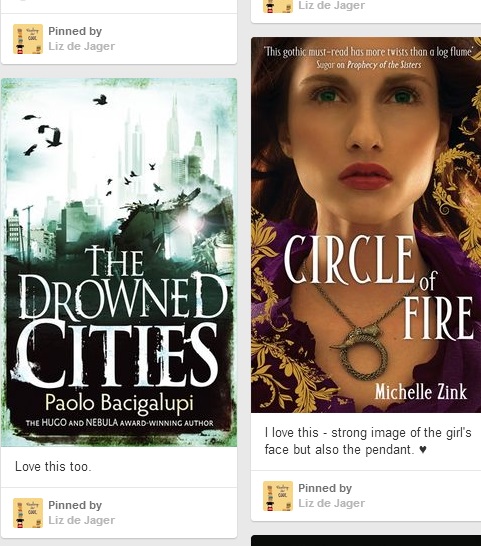
But one of the key images I’d seen was from a bus advert for Eurostar, of all things. I fell in love with the images and hunted high and low for these for weeks on end but couldn’t actually find any of them online. They were a series of shots where the woman / man’s face was superimposed over a well known city’s landmark i.e. Paris or Brussels. I liked the concept and felt it was a strong one for cover art. In addition, I found some great images from Etsy’s Imagine Studio and added them to the Pinterest board that I shared with Bella and the design team.
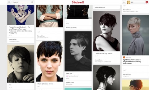
I also knew I had to be clear about what Kit looked like. I didn’t want her misrepresented on the cover at all—she was tall, strong, and dark haired. I’d spent hours surfing the internet and hitting up character boards on Pinterest and eventually found a young model whose look I adored. She seemed to embody the essence of Kit—she gave me the impression of being both strong and thoughtful and possibly stubborn. I include a few snapshots from my Pinterest boards showing the kind of look I liked for Kit, showcasing various models sourced from other boards.
I eventually had to stop sending along all the info for fear of muddying the waters, knowing I had to sit back and trust Bella and the Tor design team. The wait for the cover art, even for hints of the cover felt like a million years—but it was completely and utterly worth it, wouldn’t you agree? You can find my public Blackhart-centric Pinterest board here and my character-centric Pinterest board here.
Below, Bella Pagan shares an editor’s perspective on the cover briefing process:
The cover briefing process is so important, as the cover is one of the main ways readers are drawn to a book. They say you shouldn’t judge a book by its cover—and maybe you shouldn’t—but the fact remains that people do! So there’s a lot of pressure on the editor and the design department to get this right.
With Liz’s book Banished, there was so much rich imagery to choose from that we were very spoilt. Also, Liz was amazing and went beyond the call of duty to give not only detailed descriptions, but Pinterest boards too. For Banished we wanted something that would show the fae heart of the novel, while also hinting at its modern-day setting. And of course the character of the resourceful Kit and how she was portrayed was always going to be hugely important. I couldn’t be more delighted with the cover design we came up with for Liz as it was poetic but strong, visually stands out, and we got to geek out over some fabulous finishes too—spot UV varnish and embossing on the title. Plus the cover was printed with silver ink—so much ooing and ahhing over that! See here for the cover launch post we did at the time.
In terms of the process, we need to brief the cover a year before publication. This allows us to meet the deadlines for book retailer presentations, so when our Sales department presents the title, there is that all-important cover to go with it. These presentations happen months before the book is out so the retailer can plan their ordering and buying strategies sufficiently in advance. It’s all very tightly balanced so all the stages in the cycle can work effectively.
And onto the briefing itself… At Pan Macmillan, the editor fills out a briefing form, outlining a possible direction for the cover and answering various questions as to the messages the book is supposed to convey—should it be sad, or action-packed, or romantic? Or all three?! Plus the editor assembles supplementary materials such as imagery that resonates with the book, other book covers that seem to strike the right chord etc. Putting all the info together and the picture research can be really time consuming, as you work to identify what Design might find useful. The documents will be discussed with sales and communications departments, then the editor will present the brief to a room of people at the cover art meeting. After that, it’s a nervous wait until the visuals are unveiled in all their glory! The editor will then discuss them with the author and various tweaks and changes may be made before the cover is let loose into the world. Banished was such an exciting one to launch, as the feedback was amazing!
This article originally appeared June 4, 2014 on the Tor UK blog.
Liz de Jager fostered her love of YA and genre fiction by developing the popular My Favourite Books review blog, while writing her debut novel. This ran for seven years and enabled her to gain insights into the publishing industry. She grew up in South Africa and now lives and works in the UK with her husband Mark. Banished is de Jager’s debut novel and you can also find her on twitter as@LizUK.
Bella Pagan is a Senior commissioning editor for Pan Macmillan’s Tor imprint in the UK, working on out-of-this world SF, fantasy and urban fantasy (plus other subdivisions, factions and associated areas). On twitter as @BellaPagan.