


This illustration is for the third story in a series of short stories that started with “Dress Your Marines in White,” by Emmy Laybourne. Irene Gallo art directed once again for Tor.com.
This story, “What Mario Scietto Says,” is mostly confined to a bomb shelter, so I didn’t have too much variation for images. There’s a point in the story where the main character, Mario, piles all of his survival gear together on a bed to prepare for leaving the shelter.
I thought a nice, cropped still life might actually lend curiosity to the story, and frankly, it was the best I could come up with that I felt would be fun to paint. Irene never seemed quite enticed by the two thumbnail sketches I sent.
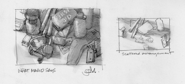
We talked about it, and I explained how I could get the painting to look similar to the first painting of the Marines. The silence on the phone told me she wasn’t buying it. My quick, superior genius realized in less than a nanosecond that I hadn’t explored the subject enough and needed to do more sketching.
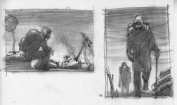
I wasn’t sure where to go, but I had an inkling of an idea. Having taught students that ‘an illustrator thinks on paper,’ it was time for me to pony up. I just started scribbling inside a rectangle and a scene started to grow into more of a full-fledged idea. I explored figures coming out of the shelter, and walking into a post-apocalyptic world.
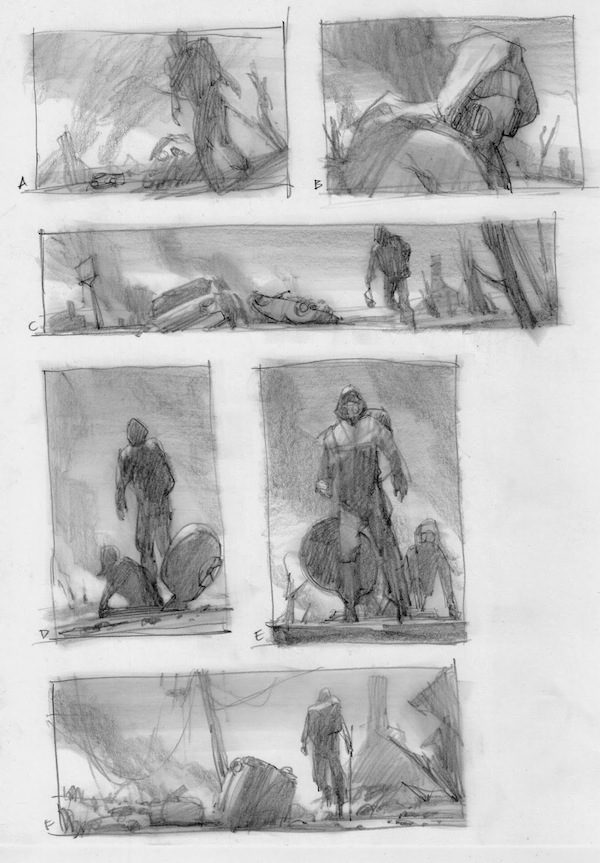
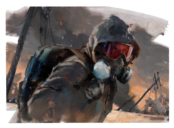
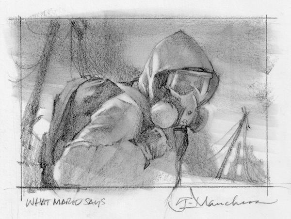
Since I had already done a street scene for the second story, Irene felt that the close-in shot of the character in a respirator, #B, would be a nice alternate direction. This was one of my favorite thumbs so I was happy to develop it into a finished sketch. I shot reference after buying a respirator to get that important detail correct.
I wanted the finish to reflect the same painting approach I’d used in the first painting. A very loose application of paint achieved by using palette knives and brushes. The trick was to keep from rendering too much, to allow myself the necessary freedom of only capturing what was important to the mood, and important to the visual interest to draw a reader in.
This is not just a simple portrait. It was critical to give the character a sense of motion, to allow the piece to have a slice-of-time element that keeps the motion frozen. To catch the character as he turns slightly to look at us while passing by, caught in stride.
The background has to work with that motion as well. The phone poles are leaning at those angles to keep the feeling of the forward motion. And again, the background elements break the space for balance. Plenty of solid diagonals for interest.
The color scheme is intentional. The browns and greys serve as a nice backdrop for the bright red-violets that commandeer our eyes to the focal point of the picture.
This article originally appeared March 5, 2014 on the Muddy Colors blog.
Gregory Manchess began his freelance career painting for OMNI magazine. His versatility and broad range of interests allowed him to crossover to mainstream illustration. There he was able to expand his client work to include covers for Time, Atlantic Monthly, spreads for Playboy, OMNI, Newsweek, and Smithsonian, and numerous book covers.