


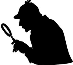
Who’s this?
You knew at first glance, didn’t you? Even without facial features or a corresponding story, it’s clear that this is a silhouette of Sherlock Holmes.
Full disclosure: I’ve never read any of Sir Arthur Conan Doyle’s original stories or novels. I’ve read Neil Gaiman’s “A Study in Emerald.” I’ve seen the first Robert Downey Jr. film, and plan on seeing the second. And, of course, I’ve seen the wonderful TV series written by Steven Moffat and Mark Gatiss. Yet, despite never having read a single word of Conan Doyle’s, I can describe what Sherlock Holmes looks like. Deerstalker cap. “Inverness” cape. This image of Sherlock, literature’s most famous detective, has come to be used like a proprietary eponym; as a symbol for detectives in general, or as an icon on the spines of books indicating that they are in the mystery genre. It could be argued, and has, that the person responsible for the look of Sherlock is as responsible as Doyle, if not more, for the character’s longevity in the pop culture consciousness.
Well, if that’s the case, I guess we’d better shine a spotlight on him during Sherlock Holmes week, huh? Let’s get to know famed illustrator, Sidney Paget.
Sidney Paget wasn’t even supposed to get this job. The Strand, the British magazine that first published Doyle’s Sherlock Holmes stories in July 1891, mistakenly sent him the letter of commission for the illustration job rather than send it to his brother, Walter Paget, also an illustrator.
Oooh! Burn! Then again, Walter Paget has been called the “least talented” illustrator amongst the Paget brothers, so had he gotten the job, the Sherlock Holmes illustrations might not seem as prestigious as they do now. Who knows?
What we do know is that Sidney Paget studied at the Royal Academy of Arts and had a successful career outside of his work for The Strand. He was well-regarded in the industry for his work in such publications as Pall Mall Magazine, the Illustrated London News, The Graphic, and The Sphere. He also provided illustrations that popularized another detective series: Arthur Morrison’s Martin Hewitt character was sort of the anti-Sherlock (in much the same way that Artemis Fowl is the anti-Harry Potter), and Paget’s illustrations were responsible for popularizing that series of stories in its time. But there are benefits to being the character that came first, and Sherlock came first, meaning that Paget’s illustrations were able to launch an already novel character into the stratosphere by providing an indelible image that would not only be popular to readers at the time, but would become associated with the character long after the writer’s and illustrator’s deaths.
Sidney Paget was not the first person to draw Holmes. That distinction goes to David Henry Friston, who illustrated A Study in Scarlet which, along with the novel The Sign of the Four, came before Conan Doyle’s first Sherlock story in The Strand, “A Scandal in Bohemia.” Paget’s ultimate success with the character is interesting when considering Friston’s original illustrations. Here’s one of Friston’s illustrations from A Study in Scarlet:
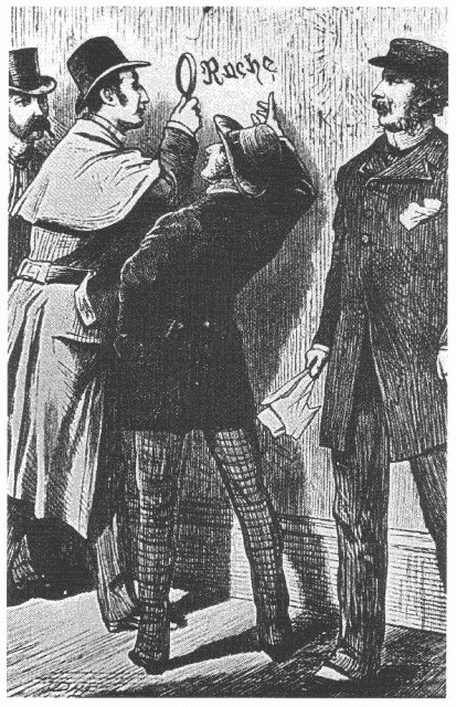
The silhouette is very similar to the one we know, but it’s….off somehow. Sherlock’s hat is curved, sort of like a deerstalker cap, but it seems to be more of an overstretched bowler. His coat is kind of like a cape, but it’s more an elongated trench coat. It’s as if Friston had an instinct about the character, but chose to ignore it in favor of clothing that Victorian readers might be more ready to accept on a protagonist.
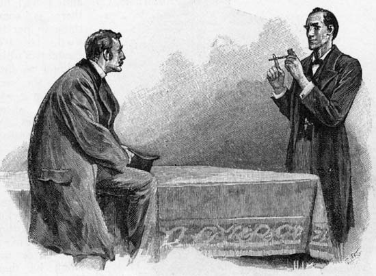
But it wasn’t this look that caught fire. It was Paget’s take on the character that did. But why? Here’s an illustration from “Silver Blaze”:
Whereas the Holmes of Friston’s illustration seems as blocky and bumbling as the police officers with which he’s surrounded, one could never mistake the Sherlock of Paget’s illustration for a mere police officer. In the stories, Watson describes Holmes as “bohemian” and “eccentric,” but he is also clearly an upper-class, university-educated man with a sense of fashion and propriety. This may be why Paget only depicted Sherlock in the deerstalker cap and Inverness cape in appropriate situations, like when he was working out in a rural setting, or traveling cross-country like in the above illustration, or the first time he dons the get-up in “The Boscombe Valley Mystery.” However, the choice of garb also suggests something about the character that I think was intentional. Sherlock isn’t just a consulting detective. He’s a hunter—methodical, patient, and constantly springing back waiting to pounce or come out from behind something and yell “Ah, HA!” The Sherlock of Paget’s illustrations seems comfortable in or out of the hat and cape, which speaks to his bohemian nature. Whether in a Victorian drawing room, or wandering around the grounds of a country estate, Sherlock is always at home and always entirely himself—as long as he’s on a case.
In this essay on the illustrations for “A Scandal in Bohemia,” the author (sadly, I couldn’t find his/her name) says “[‘A Scandal in Bohemia’] was the first story illustrated by Paget. In it he established not only recognizable features that would become synonymous with Holmes and Watson, but he also established an air of confidence and sureness of action that would be the foundation of their relationship and their cases. Paget makes us see the English in the characters. And therein lies the magic.” It isn’t just the hat and cape. Paget’s illustrations capture the dynamics of Holmes and Watson, both in relation to each other and to other characters in a way that illustrators after Paget tried desperately to imitate. The choice of deerstalker cap and Inverness cape also emphasize the Britishness of the character, which may be another reason why that particular image is so indelible. Paget’s choices make the character specific. Sherlock Holmes isn’t just any consulting detective. He’s a resolutely British one, and Paget chose to emphasize those things, rather than try to make him “universal.” It is that kind of specificity that makes a work of art survive the test of time.
I first learned about Sidney Paget at Geek Girl Con back in October, when I went to a Scott Westerfeld panel and he did an amazing presentation about the importance of illustration. Using Paget as an example, he showed how important an illustrator could be not only in creating a work of fiction, but in sparking the imagination of the reader. He regrets that, for some reason, we’ve gotten it into our heads that illustration is the sole purview of children’s books and comics, and that the common argument against “pictures” in books is that it stifles the imagination, when illustrations used to accompany most books for adults! Meanwhile, I regret the fact that short fiction, which once had a permanent home in mainstream publications seems to have gone the way of the dinosaur (or worse, the way of the underperforming short story collection). Perhaps, remembering successes like Doyle’s Sherlock Holmes stories and Sidney Paget’s timeless illustrations might help us remember what it is that people love about fiction. Not all stories with pictures are for children. We’ve started to accept this with comics and graphic novels. However, that medium is mostly pictures with fewer words. There is a way for prose stories to benefit from the use of well-placed and beautifully-drawn illustrations. Here’s hoping that, by remembering the work of Sidney Paget, we remember how to go about doing that.
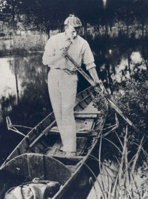
And now, I’ll leave you with a photo of Sidney Paget in a deerstalker cap. It seems appropriate.
Teresa Jusino likes pictures. She can be heard on the popular Doctor Who podcast, 2 Minute Time Lord, participating in a roundtable on Series 6.1. Her “feminist brown person” take on pop culture has been featured on websites like ChinaShopMag.com, PinkRaygun.com, Newsarama, and PopMatters.com. Her fiction has appeared in the sci-fi literary magazine, Crossed Genres; she is the editor of Beginning of Line, the Caprica fan fiction site; and her essay “Why Joss is More Important Than His ‘Verse” is included in Whedonistas: A Celebration of the Worlds of Joss Whedon By the Women Who Love Them, which is on sale now wherever books are sold! 2012 will see Teresa’s work in an upcoming non-fiction sci-fi anthology. Get Twitterpated with Teresa, “like” her on Facebook, or visit her at The Teresa Jusino Experience.