There is a curse and blessing when it comes to repacking older books. The blessing is having all the triumphs and failures of past editions to react to (much easier than starting with a blank canvas) and having a thick history of fan reactions to the book itself. The curse: that same history of fandom—many people know the book and bring their affections with them when they see its new suit. When Stand on Zanzibar first showed up on our list I knew we were in for treat simply by listening to how all the editors at Tor Books reacted to it.
I asked Jamie Stafford-Hill (Tor Book designer as well as Tor.com’s designer) to take the project on. Jamie is a purist at heart and, after a few quick attempts at using some imagery, he decided to tackle it as an all-type cover.
From Jamie:
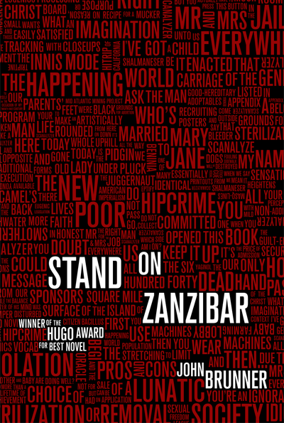
Ultimately there is just so much going on in this book it felt impossible and unwise to reduce it to a single image. My initial notes say stuff like “collage,” “sink or swim,” “BUSY,” and “use text from the book?” with a lot of thematic keywords. I tried working visually with some of the themes (overcrowding, anxiety, alienation, decadence) but it just wasn’t coming together in the right way.
While researching I found a blog post about Centipede Press’s edition. Designer and illustrator Jacob McMurray had done a fantastic job with a collection of interior collage illustrations, but part of what makes them work is the plurality—only a multitude of images can hope to capture any of this book. But couple of them incorporated text and inspired me to take another look at a type-centric approach.
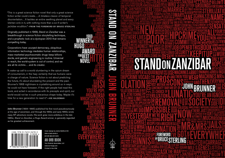
What had really stayed with me from my first read was the sense of having been thrown in the deep end, floundering in a sea of (seemingly) context-less words, names, slogans. Even after finishing the book, skimming those first few chapters again is still fairly overwhelming, but with this other dimension of memory and insight. Eventually I realized I could give both of those experiences to readers old and new in the same way the author had: throw a lot of type at them.
The editor and I worked together to pick dozens of phrases and words, and as a type geek I had a blast spending hours in illustrator getting them all just right. Highlighting the title within it’s book context seemed natural (shown at right) but in the end didn’t work as well as just setting it straight, like the author.
Being a classic in the field, many of our editors seemed to take an interest in the book. As copies hit in our lobby, they came down one by one to say they loved the cover. So (not for the first time) I say, thanks, Jamie, for making us look good.
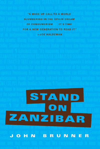
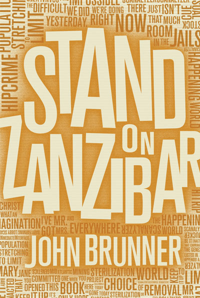
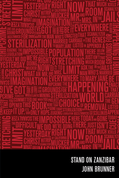
Here are a handful of the renditions leading up to the final. There are many others that show subtle shifts in the typography… constant shifts back and forth to get everything to sit just right.
And finally….