


A pop-up book, or to use the broader term, a mechanical book, can become a physical tribute to the internal wonder of reading. The sensation of dreamy description expanding in the reader’s mind is made manifest in the joyful discoveries to be uncovered in manipulating the mechanical book’s features.
The term pop-up goes back to the 1940s, where it was used to describe mechanical books specifically meant for children. This may be part of the reason that mechanical books are often associated with a juvenile audience. But they’ve been around for about 700 years, and weren’t made for kids until the 18th century, which saw a rise in books created for children’s amusement rather than strictly for moral instruction or education. Even then, many of the most successful mechanical books of that era were examples of sexual or scatological humor and definitely not for kids.
There have been some gorgeous pop-up books in recent years. My two favorites have been ABC3D by Marion Bataille and Trail by David Pelham.
ABC3D is an alphabet book, but it’s an alphabet book in the sense that Château Latour is old grape juice. As the Washington Post said of it, “Does for paper what claymation did for mud.” Every turn of the page brings a letter into unique and bold relief, and in some cases, multiple letter combinations come about through shifts and pulls and manipulation of tabs. Parisian graphic designer Bataille transforms the basic elements of written language into a delightful investigation of the elegance of graphic representation.
Trail is done all in white but for an ongoing silvery track followed throughout the book. While ABC3D brings the viewer to appreciate the potential in the familiar and simple, Trail compels us to take a very close look at the incredible complexity of the life environment of a snail. I’d never heard of Pelham before this book, but I’ve since learned he was a very influential artist and designer for Penguin during the 1970s.
Speaking of book designers, I think that many readers never consciously acknowledge the majority of design elements in a book’s interior. This is, I think, as it should be; the reader’s experience should flow uninterrupted. The reader doesn’t need to be overtly aware of font choice or leading and kerning and all that stuff. They know when it doesn’t work—eyes wander, words are skipped, the immersion falters—even if they don’t quite know what went wrong. In this sense, the book designer’s job can be a bit thankless, even as it is crucial to the reader’s enjoyment. 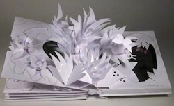
Even in illustrated works and books with a greater amount of graphic focus, few eyes appreciate all the work that goes into it. On the other end of the spectrum is the near-invisible design involved in creating a mass-market paperback interior, though even here the book’s design is a key feature. I love mechanical books because they ignore the idea of a book as a container for words and instead become portable museums.
When Jason Henninger isn’t reading, writing, juggling, cooking or raising evil genii, he works for Living Buddhism magazine in Santa Monica, CA.