


This is the second piece in a short series of articles featuring one author’s reaction to some of the covers that have appeared on her books. You might like to look at the first paragraph or so of “Look at What They’ve Wrapped Around My Baby!” This gives my comments on the qualifications of authors in general as critics of cover art.
This particular piece is going to focus on a cover that I think may have seriously hurt my career: that of my third novel, The Pipes of Orpheus, which was released as a mass market paperback from Avon in October of 1995.
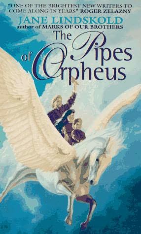
This cover, by Kevin Johnson, is dominated by a gorgeous wash of blue sky and white clouds. The central figure is a magnificently rendered pearl-white pegasus. Three children, wearing clothing in shades of brown, are seated on its back. Their postures are erect and confident. The tallest holds a pan pipe raised high in one hand.
It’s a great painting. It is even a semi-accurate description of a scene in the novel. So why do I have such problems with this as a cover for this book?
My first problem is the tone. This cover is the third of what an unusually outspoken reviewer called Avon’s “fluffy bunny” covers for my books. I have always felt that these covers created the wrong impression about my writing, an impression I have continued, to one degree or another, to fight against throughout my career.
In the novel, the scene illustrated on this cover is far from bright and confident. It is actually one of the darkest in a very dark book. The three characters aren’t confident. They’re terrified, horrified, and very aware of doom approaching for someone they have all come—in very different ways—to love.
My second problem with this cover is the implied audience for the book. It looks like a kid’s book—and not a Harry Potter-type YA that might appeal to adults as well, but a solidly “kiddie” book.
This is due, in large part, to the one glaring representational error in the art. By the time this scene occurs, the children are not children any longer. The boy with the panpipes, for example, is actually a muscular young man of twenty-two.
However, I don’t know how many times I had to (reluctantly) stop an adult from buying The Pipes of Orpheus for some eager, bright-eyed, eight-year-old. Usually, I’d ask the adult to at least read the opening—which features the detailed evisceration of a small child—before they made their purchase. Needless to say, I lost the sale, without ever reaching those who would have loved this tale of Greek myth and more modern vampire lore.
You may think I’m overreacting when I say that I feel my first three covers from Avon had a seriously negative impact on my career. After all, readers are sophisticated enough not to judge a book by its cover, right?
To this I can only offer the following anecdote. I first met my now-husband, Jim Moore, when I joined a gaming group of which he was a long-standing member. Jim is an avid, long-time reader of Science Fiction and Fantasy.
Jim tells how, after meeting me, he went to a book store with the intent of buying one of my books. He picked up The Pipes of Orpheus, then set it down without even reading the jacket copy—copy which was much truer to the tone and audience of the novel than the cover.
His comment at the time, as reported to me much later, was: “Oh. I didn’t know Jane wrote kids’ books.”
I rest my case.