


Judge Dee and the Executioner of Epinal
Comment number:
3

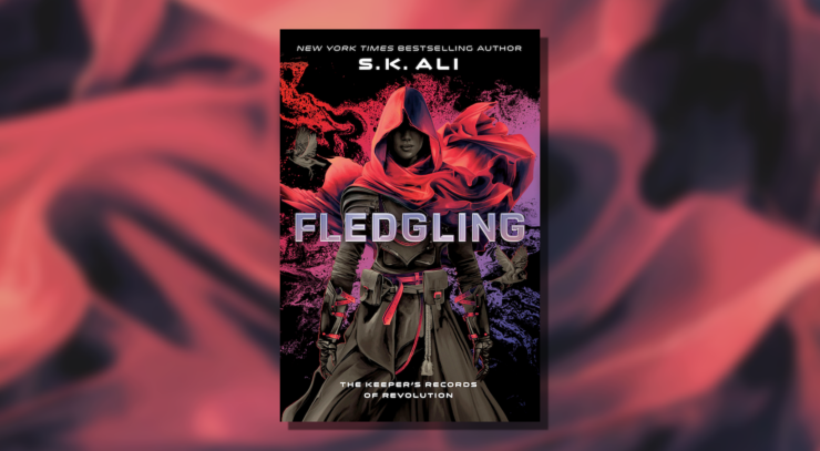
The start of a new dystopian duology by S.K. Ali, set in a fractured world on the brink of eithe...
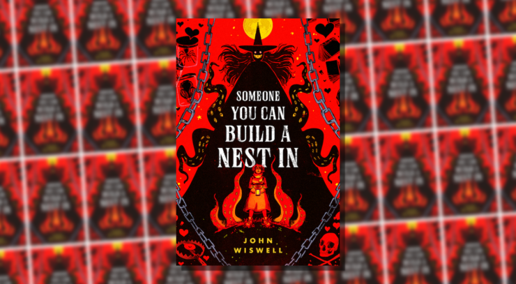
A review of John Wiswell's fantasy debut.
Welcome back to Reading the Weird, in which we get girl cooties all over weird fiction, cosmic h...
Inventing a future is always tricky...
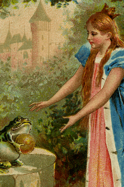
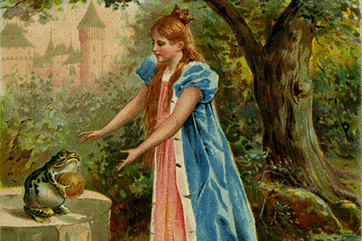
Five froggy tales filled with transformations, occasional romance, and royals behaving badly...
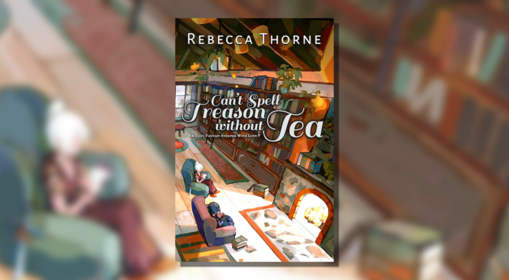
A cozy fantasy steeped in sapphic romance about one of the Queen’s private guards and a powerful...

This month we're adding 5 urban fantasies from the last decade to our TBR stacks.
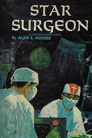
Fledgling doctors learn on the go in this delightful adventure tale set aboard a spaceship...
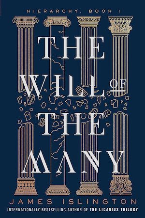
In this thrilling high fantasy, a fugitive former royal works to bring down an oppressive empire...

Whether you're exorcising demons or soothing troubled spirits, every endeavor is better with mus...

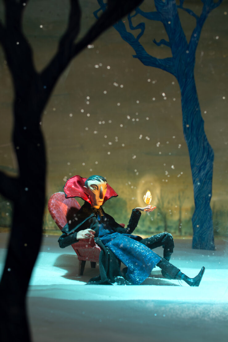
When she ventures into the shadowed woods, Malka finds a monster, but not the one she expects...
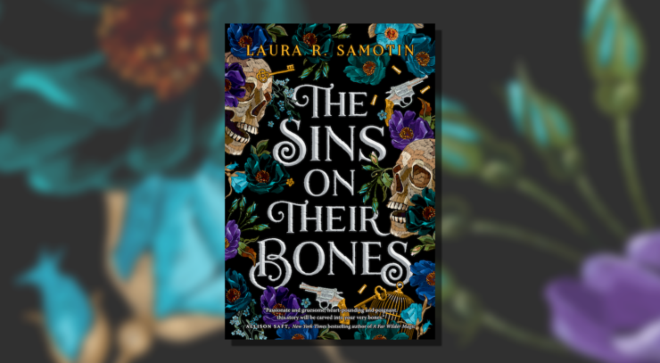
A queer dark fantasy set in a Jewish folklore-inspired reimagining of 19th century Eastern Europ...

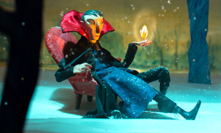
Unknown forces attempt to stop Judge Dee and Jonathan from transporting a mysterious and possibl...
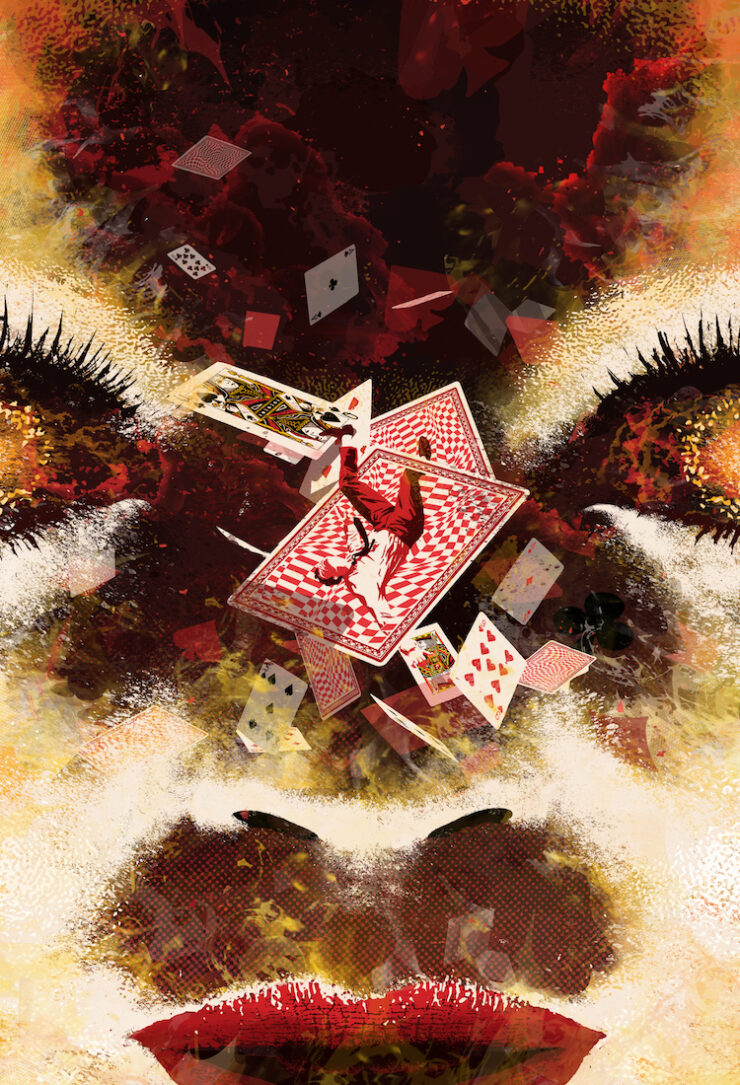
A woman visiting Las Vegas for a fun weekend encounters her ne’er-do-well ex-husband, who begs h...
The fourth and final installment of a new serialized novella from Hugo Award-winning author Sara...
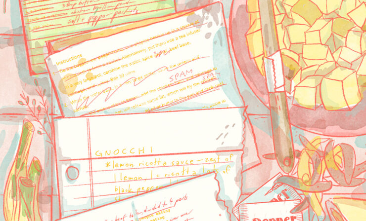
The third installment of a new serialized novella from Hugo Award-winning author Sarah Gailey...
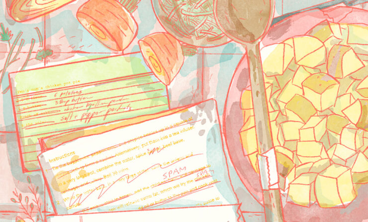
The second installment of a new serialized novella from Hugo Award-winning author Sarah Gailey.....

A Brazilian freelance journalist confronts the grim reality her past choices created when she co...
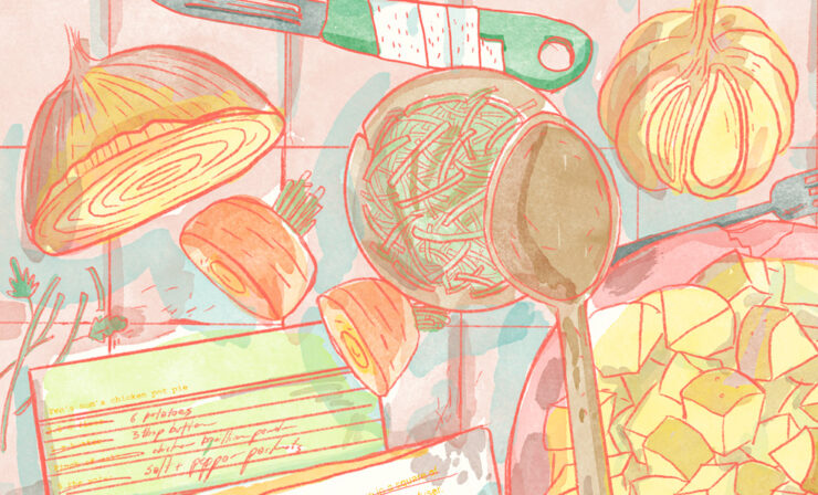
Introducing a new serialized novella from Hugo Award-winning author Sarah Gailey...
In a future where human souls take the form of animal companions, Hairuo struggles to keep her c...