Artist Tommy Arnold has worked on a wide range of titles in science fiction and fantasy, from Krista D. Ball’s The Demons We See to David Dalglish’s Fireborn—he’s also illustrated some of Tor.com’s original short fiction, including Jennifer Fallon’s “First Kill” and John Chu’s “Hold Time Violations“.
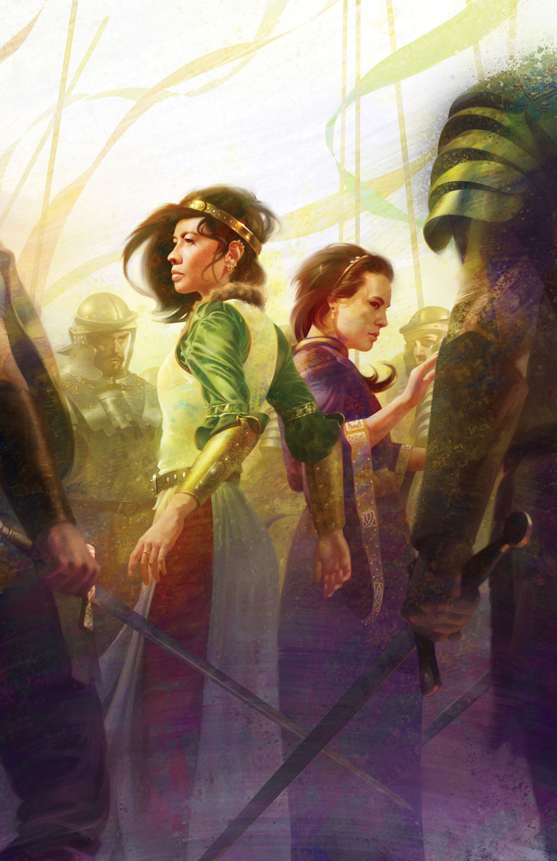
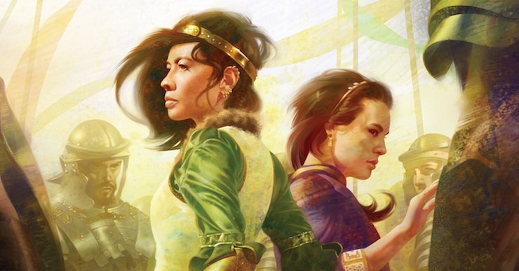
We’re thrilled that Arnold has also turned his talents to Fran Wilde’s The Jewel and Her Lapidary, an epic fantasy novella forthcoming from Tor.com Publishing on May 3rd. Below, Arnold walks us through his process for capturing the novella’s central characters Lin and Sima, from early sketches through the final cover result!
0 | Sketches
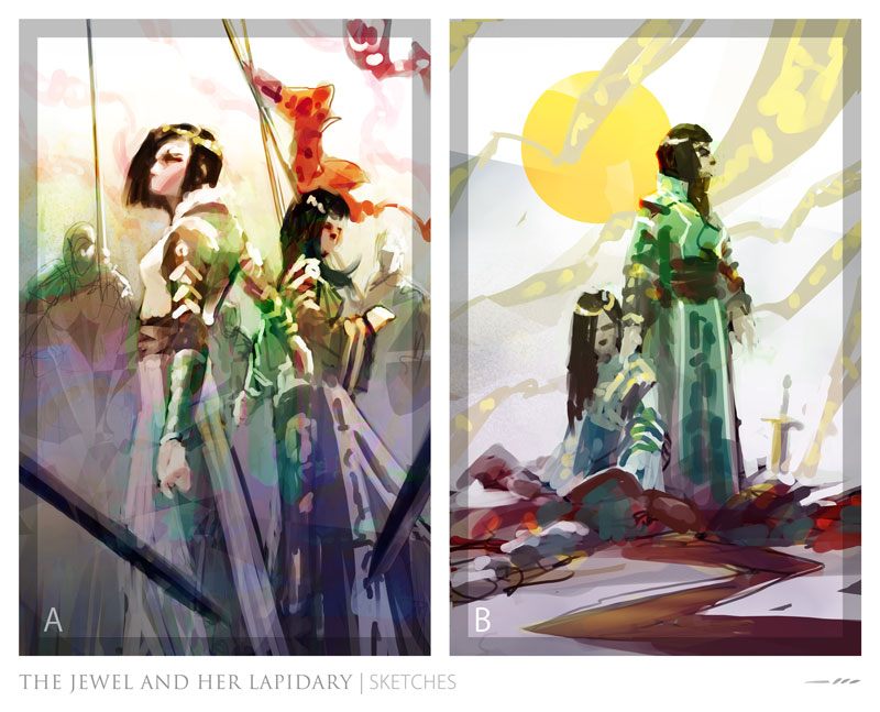
After reading the story and giving it a few days to sink in, I try to take the concentrated vision/mood I’m left with and put that on the canvas. Christine [Foltzer, Associate Art Director] and I had talked early on about showcasing both key characters and creating a feeling of abundant color, so I try to make sure my sketches touch on those notes.
Christine goes with sketch A and I’m off to gather reference.
It should be noted that though I won’t go into great detail on it here, reference gathering is a hugely integral part of the drawing process!
1 | Tight Drawing & Value Block-In
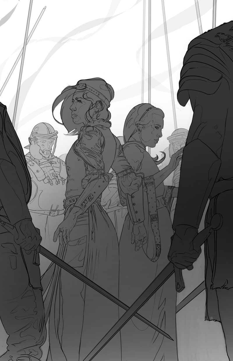
I approach the drawing almost as if someone else had done the sketch. I want to keep what they’ve done well, but I also want to improve upon their design. Effort, when applied to these big tasks (the early tasks), is a very finite resource and so each stage is an opportunity to start fresh and push further with the same idea. Things change more at this stage than at any other, and I’m lucky to work with ADs like Christine who let me get away with this iterative process. As a safety measure (especially on a piece that changes this much), I send her the tight drawing before going any further.
2 | Value Painting
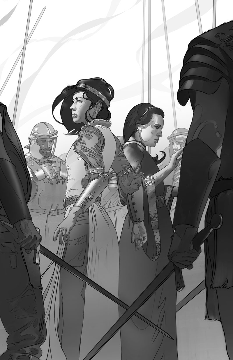
This is a continuation of the block-in, wherein I further differentiate my values and start the painting process in earnest. The black-and-white painting work will really respond to the transparent painting that comes later, and make my life a lot easier.
3 | Prepping for Color
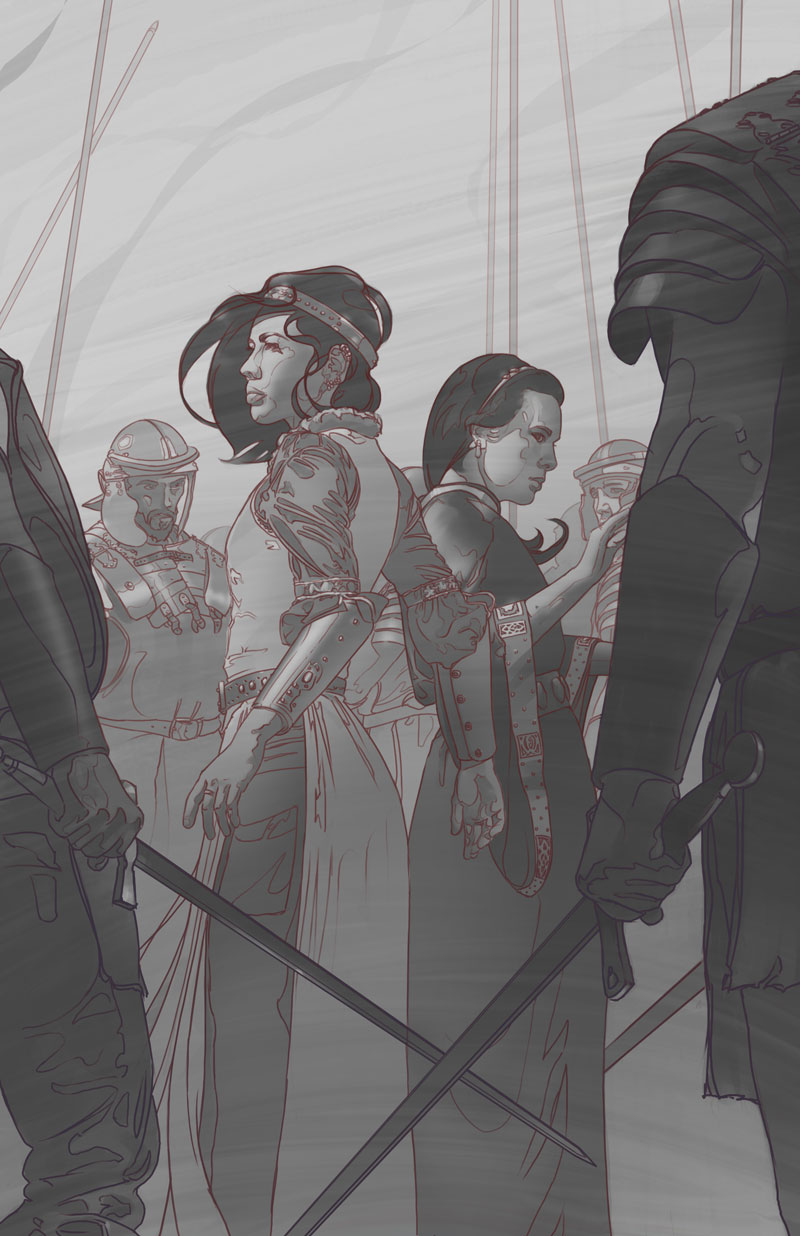
Here I take my painting and glaze back all my values, protecting myself against the harsh contrast jumps that accompany transparent blending modes.
I tone all my lines to red, so that their warmth bleeds into the colors I’ll lay down next. I know I want my foreground characters to be cool in temperature, so those lines go purple (cool red).
Lastly, I start to spill texture over the canvas in rhythms that will enhance the movement of the piece. Just like the value work earlier, this is something that will really get picked up by the transparent paint, so I want it in there early.
4 | Color Balance
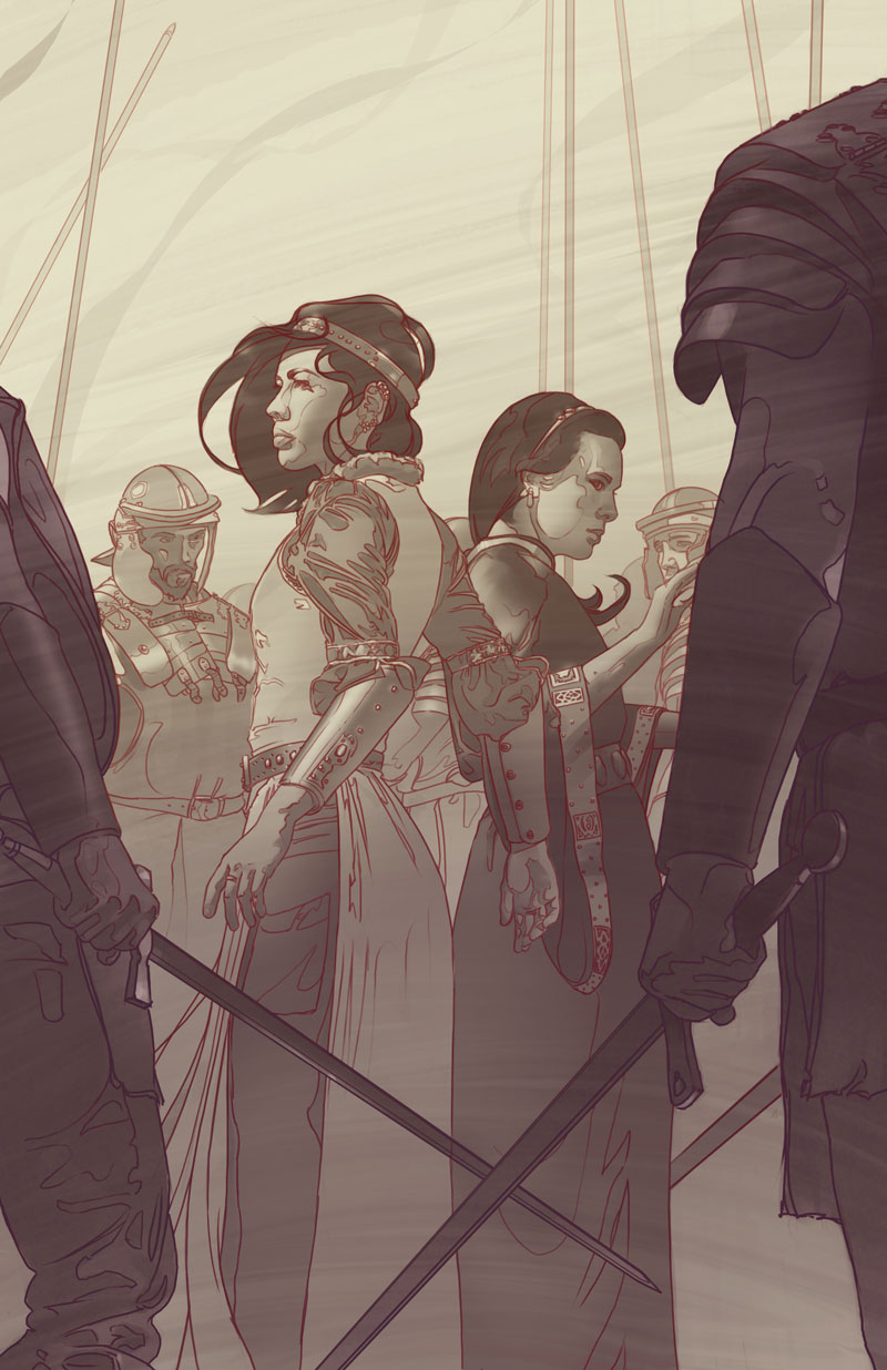
Here I use color-balancing to “tone” the canvas, further priming it for color. I start to shift the Mid-ground to the warm palette I’m anticipating, and I again treat the foreground separately to preserve my depth of temperature moving forward.
5 | Color Abstract
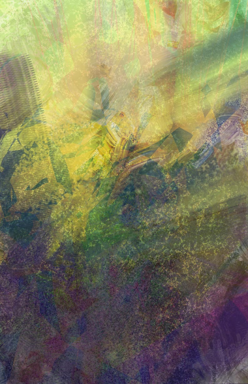
In this stage I coat the canvas with mid-tone color that will work well on top of the structure I’ve already built. I try to get as much texture and color variation into this flat, abstract piece of art as possible, keeping in mind the overall color harmonies I wish to achieve and the equivalent position of shapes in my composition.
6 | Transparent Painting—Ugly Stage
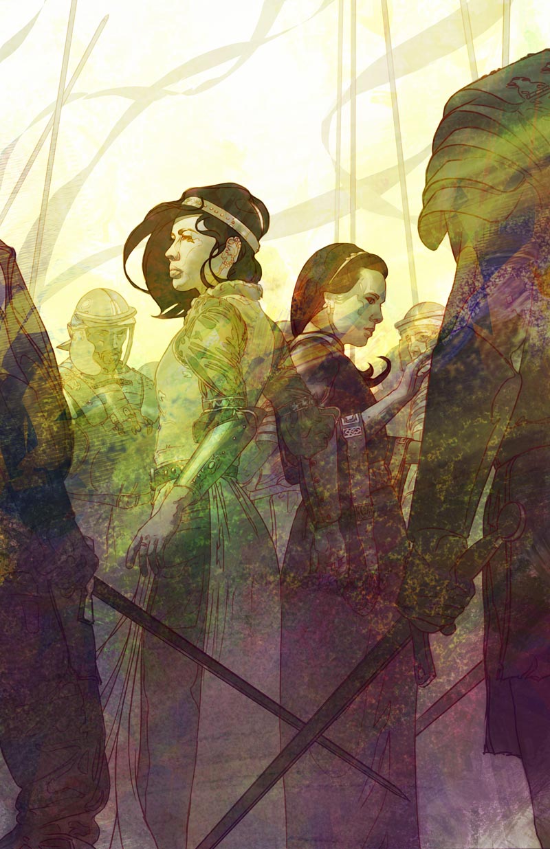
Now I’ve got to combine the color abstract and the drawing. There’s a lot of push and pull that goes on here…
7 | Transparent Painting—Greater Harmonies
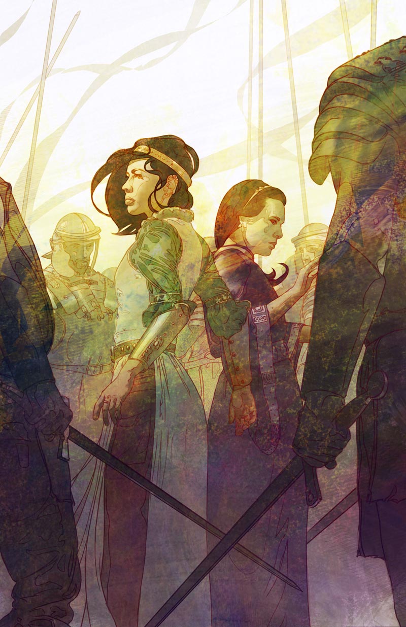
Here I’ve started to execute large drifts of color on top of my mess to re-introduce a bit of order. Colors drift from cool to neutral as they go back in space, and they also drift cool to warm as they rise towards the light. I have to focus to balance what looks good abstractly against what contributes to my light and color scheme.
8 | Mixed Painting
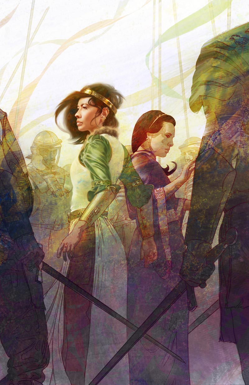
Eventually I hit the limit of what transparent painting will allow and I’m forced to start slowly introducing opaque paint to define focal areas.
9 | Reinforcement
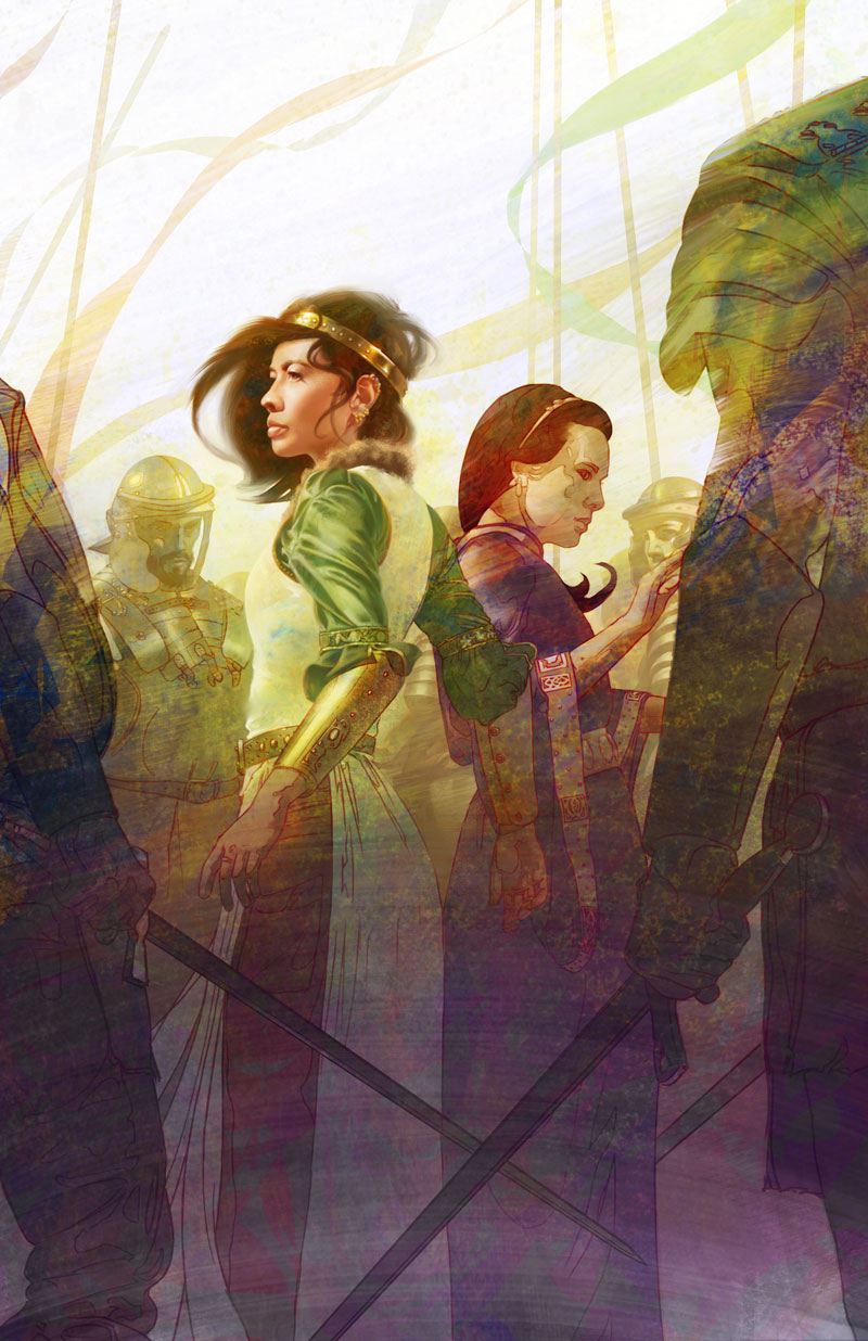
I’ve started to lose some of my early textures under all this paint. I want a very specific sweep of texture through this piece to harmonize with the movements of the characters, so I do a bit of work to bring that back in, and continue to enhance the purple-to-yellow shift from bottom to top.
10 -11 | Opaque Paint

I keep making the most of transparent paint and substituting (where necessary—more and more often) with opaque paint as I finish painting out the remaining characters. With my focal points established, I have a great base against which to judge new marks so the process flows very smoothly from here to the finish.