


I’ll be honest: I have no idea what I’m doing here.
This puts me in the same position as a lot of the characters in the stories from the Welcome to Bordertown anthology. They show up at this fantastic place—already full of people leading lives crazy with context—and have to figure out, quickly, where they fit in.
Just like in the book, I’m not the only dork in new shoes scooting up to the bar at the Dancing Ferret for my free pint. I do have one distinction (or is it a liability? My mom says it’s a distinction)—I’m the only one in the book who drew a story. My normal gig is writing and drawing Family Man, a graphic novel set in a bucolic 18th century German university. Urban fantasy prose? Not so much.
My writer (and good friend) Sara Ryan guided me through the streets of Bordertown, laying down the bones for Fair Trade, a story that felt like a walking tour given by a longtime local. But trying to capture the look and feel of a place that countless readers had visited in their minds? Without pissing too many of them off? That was my problem.
So, starting with Sara’s script, here’s how I found my way into Bordertown; or, at least, one page of Bordertown. Process nerds: engage!
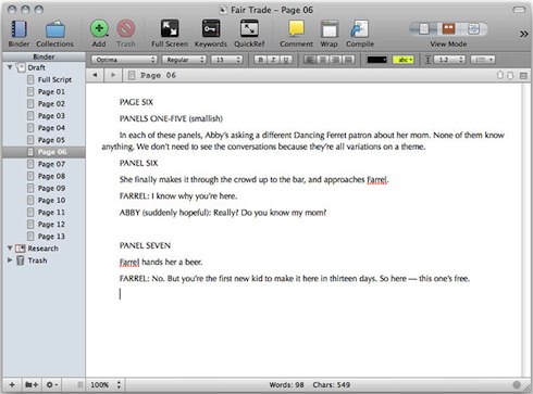
1) SCRIPT. Sara and I had a few story conferences; at every one of these meet-ups, Sara had an awesome new cyberpunk hairstyle, while I managed to get food on my shirt. This is the foundation of our creative partnership.
Eventually we arrived at a draft that passed editorial muster. Comics scripts work a lot like screenplays in some ways, with “panels” taking the place of “shots.” Panels are divided up into pages. Because Sara is a kind and loving god, the number of panels per page was generally low—plenty of room for me to interpret and play with the images rather than cramming everything in.
I took the script into Scrivener, a fantastic piece of writing/research/project software, and broke up the script into what would be the separate, drawn pages for easy reference.
2) CHARACTER DESIGNS. Perhaps the greatest game of dress-up-and-pretend ever invented, the “character design” phase of comic book making is one of my favorite things. Sara had seen an editorial drawing I’d done recently of the rock artist St. Vincent, aka Annie Clark, and told me she’d be a good model for our protagonist, Abby:
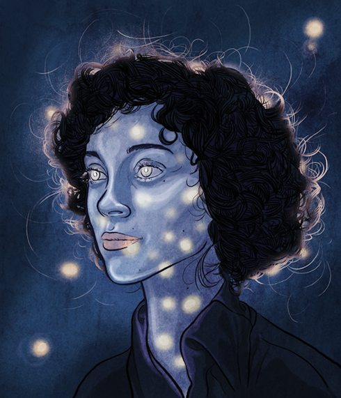
This meant I got to look up a lot of pictures of St. Vincent. (It’s a rough life.)
When trying to draw a likeness or a closely derived look, I like digitally tracing, with a tablet and stylus, over a few photo references, so I can find the lines and shapes that make a person look the way they do. Like this:
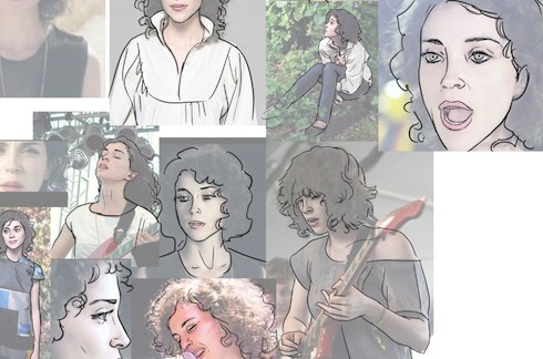
Then I put that reference away and draw, in a less photographic style, what my brain remembers as being the most important information. When time allows, I’ll do an entire model sheet—the character from every rotation and in every major emotion, to use as reference later. Time did not allow. Damn you, time.
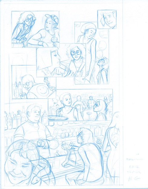
3) LAYOUT. Next up was the comic book equivalent of a storyboard; the page layout, in which you organize all the image content into a pleasing-looking miniature mock-up of the final page. Most artists really like to get their hands dirty with this part, putting together a dynamic, detailed sketch that contains all the major visual elements of the future page, thinking through the final image in their heads, savoring it all like a fine wine.
Personally, I hate layouts with a screaming passion and wish that I could throw them into the river and then, after they’d drowned, beat their brains out on the wet sand. So I do a lot of increasingly angry scribbles until I get tired, accept my own mortality, and pick whichever one doesn’t actively make me embarrassed for my unborn children.
I tend to get rid of these layouts later, to eliminate incriminating evidence, so please accept this recreation of the layout process for this page:
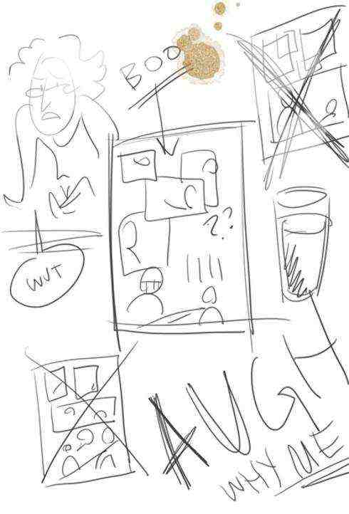
I decided that Panel Seven would work better if it moved onto the next page, leaving me with one big, almost wordless page which ends in our protagonist’s first bonafide Bordertown encounter; the action of the page flomps down onto that barstool almost as hard as Abby does. Nobody objected to this, because my genius was apparent.
4) PENCILLING. This is where the magic happens. And, by magic, I mean “hours of extremely fussy work.” Using a pencil with blue lead (stay tuned to find out why!), I drew all the images on the page, more or less as they would appear in the final. The image below shows all of the refining and backtracking involved, some of the tricky mental work that goes into making up convincing images out of thin air:
I generally have no trouble coming up with wacky characters, and the denizens of this page came to me pretty easily. (That angry guy with the smiley vest? I will always be proud of that guy.)
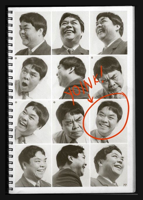
But every now and then it’s good to introduce a face or a type that might not have occurred to me naturally.
I work at Periscope Studio, a collective of two-dozen comic book artists; we have a lot of weird books around for just this purpose. For the fellow in the bottom left corner (the one with the snake), I went hunting through a 70’s era photo compilation of interesting-looking folk mugging for the camera.
I ran into this guy after a few minutes, and it was love. I picked one of the most helpful images and, with a little youth-ening, drew in his Bordertown debut.
5) INKING. And here’s where I create the fancy final lines, and come home with hands as black as a coal-miner’s for a few days. Using a combination of technical pens and brush pens loaded with permanent ink, I traced over the sketchy pencils, adding some sinuousness to the lines and draping in all of the swaths of black that would help create the right atmosphere. This part is fun and, dare I say it, sexy. If you’re into that kind of thing.
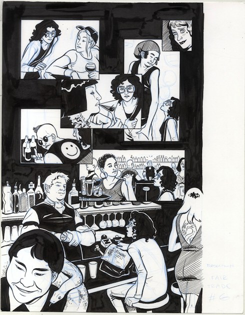
It looks kind of blotchy, right? You can still see the blue, and all the places where my pen was going dry because I got up to make tea, or poke a studiomate in the face. But now, through the miracle of science—
6) FINALS AND LETTERING. I scan in the inked page, run it through some fancy Photoshop filters that first cleverly drop out only blue lines and then simplify all the tones into pure black and white (just like my moral beliefs!) Then I drag the whole show into Adobe Illustrator, where, in a process too boring even for you (almost too boring for me; coffee was involved), I carve out word balloons and fill them with live digital text—in this case, the lovely dialogue font “Cloudsplitter” from Nate Piekos’ company Blambot Fonts.
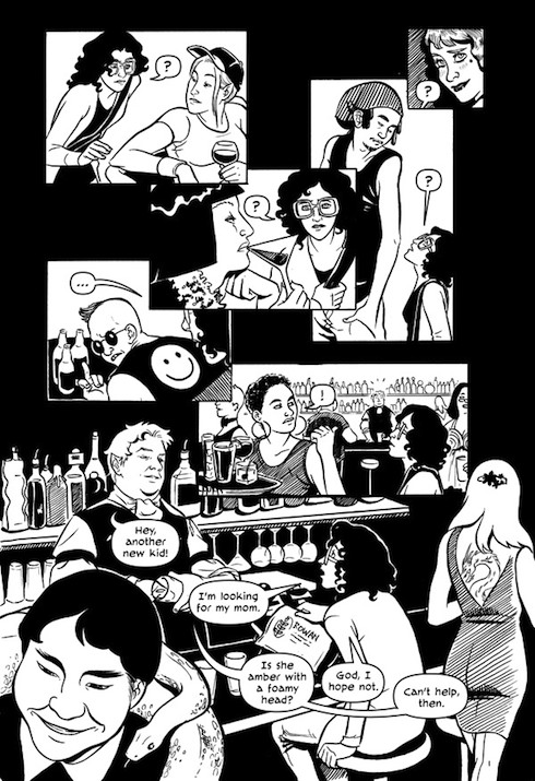
Did you notice that there’s an entire chunk of dialogue that wasn’t in the script? That whole “foamy head” joke? Sara’s husband (and my studiomate), consummate pro cartoonist Steve Lieber, tossed that one off.
I was drawing away in our crazy ramshackle studio and felt something was missing, so I asked everybody in range for a good quip to fit the scene. Steve said it, and in it went, free of charge and no questions asked.
If that ain’t Bordertown, I don’t know what is.
Dylan Meconis spent seven years germinating at the Northwest School, where even the popular kids were huge nerds. She then moved on to Wesleyan University, where she studied in the College of Letters, learning all sorts of things about history, literature, philosophy, and language, and lived in Paris for definitely not long enough. In between classes she drew Bite Me!, a comic involving vampires getting into humorous situations in the French Revolution. She has produced artwork, visual narratives, and more for diverse companies from Microsoft to the Gates Foundation.