


Leviathan, Scott Westerfeld’s highly anticipated and extensively illustrated young adult steampunk novel, releases today. Whenever I’d run into Scott over the past year or so he’d whip out his iPhone and excitedly show-off the latest drawings by Keith Thompson. After a few of these incidents it became clear that Keith wasn’t just adding a few embellishments to the book but, with fifty drawings throughout, was helping to create the world of Leviathan.
Here is the first of two interviews on those drawings and the process behind them, this one with Scott talking about his dual role as author/art director. Come back Thursday for part 2, an interview with Keith Thompson.
Can you give us a quick description of Leviathan?
It’s an alternate history of World War I, sent in a world in which Charles Darwin discovered DNA fifty years earlier. The Victorian Empire was built on the backs of fabricated species, while the Germanic peoples went the route of mechanics. So the war is between retro biotech (living airships, message lizards) and clunky armored vehicles. The main characters are the son of the Archduke Ferdinand who’s on the run from the men who killed his parents (in this world, the conspiracy theories are true—the Germans did it!) and a Scottish girl who’s pretending to be a boy so she can serve on a military airship.
 How many drawings did Keith Thompson do for the book?
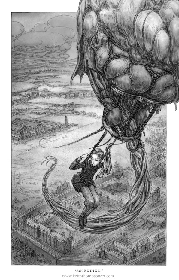
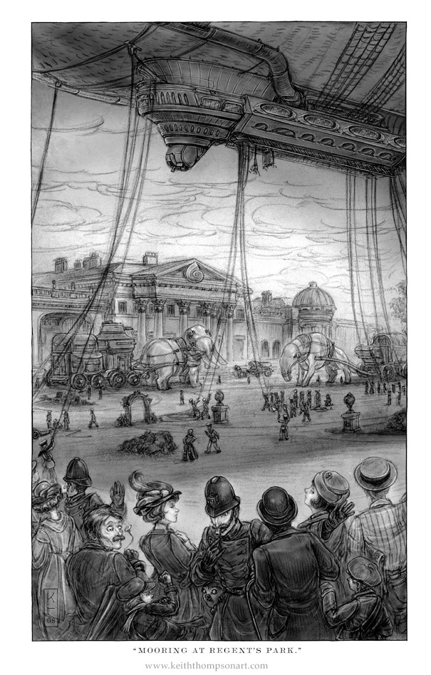
We went a bit crazy and wound up with fifty illustrations, most full page, so you get a visual hit every nine pages or so. At the same time that Book 3 comes out, we’re releasing a “Manual of Aeronautics” with cutaways and deck plans of the machines and creatures in the series, in large format and full color. So Keith’s a very busy guy.
Did you know before you started writing that you wanted a heavily illustrated novel or did that evolve as you started writing?
I’d written the first 16,000 words as a regular novel, but then I was trawling for visual inspiration from the rich vein of DIY steampunk culture, and realized that the book itself could look like an object from the period. Most novels were illustrated back then, and quite handsomely, and Keith has reverse engineered that style. The result is a sort of “Victorian Manga” look, based on Punch magazine illustrations in 1914. It feels very old-school, but it’s still accessible to the modern eye.
How did you find Keith?
On the internet, but we’ve agreed not to tell our parents. He had the three things I wanted: a hand-crafted look, awesome creature design skills, and a great touch for machines as well.
 If I understand correctly, you were the acting art director? Do you find anything surprising about the experience?
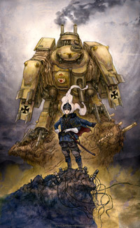
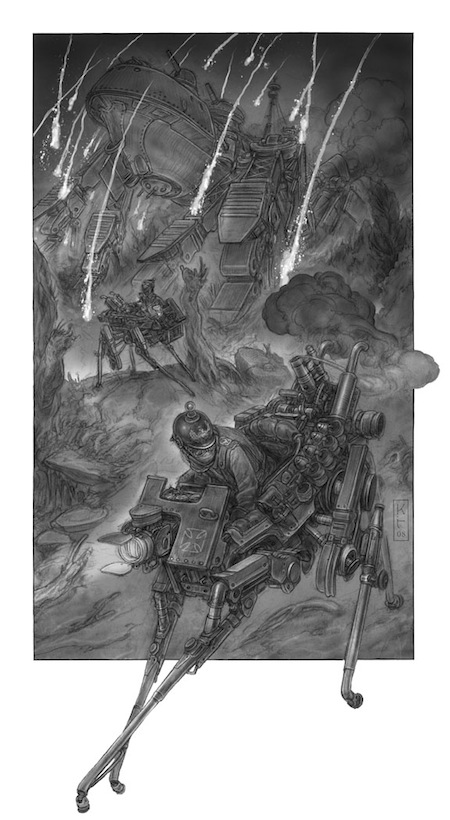
Well, there was an excellent designer at S&S helping us, but I paid Keith directly, so I had a lot of control over the process. I didn’t realize how much work would be involved, though. It’s like making a fantasy film: we had to design the whole world. Not just fabricated beasties and machines, but also costumes, furniture, and props. We effectively created two rival aesthetics, basing the Darwinist look on art nouveux (with lots of nautilus shells and other organiform shapes), and the Clanker style on WWI futurism (dreadnoughts that walk!) combined with a dollop of Hapsburg heraldry.
Keith is a superb researcher, and found a few wacky historical attempts at creating walkers and such, so we did have some period stuff to guide us. Oddly, those inventions are the most improbable objects in the book.
 Can you point to a specific image where you were completely surprised by Keith’s interpretation?
The main armored vehicle in the book is called a Cyklop Stormwalker, and I didn’t realize how huge it was until I saw Keith’s illustration. I questioned him about the scale, but then he demonstrated (with cutaways!) how the machine had to be at least that big to match my text. In short, he understood what I’d written better than I did, because to draw it he had to. I’m a pretty visual writer, but this process brought home how much we novelists are cheating in our heads. (Or maybe that’s just me.)
I assume you guys are hard at work on book two. Is there some aspect of the process that you are glad to have learned from the first book?
I’ve learned a lot about stage managing for illustration. Sometimes you have to delete characters from a scene just to keep from overcrowding the image. I’ve also learned to making big-scale design decisions early. For example, in Book 2 we go to the Ottoman Empire, and had to create a whole new aesthetic. The Turks are Clankers, like the Germans, but with a somewhat more Byzantine design sensibility. So we started working on the visual world from the beginning, with me writing scenes to introduce the machines of Istanbul early in the book.
 Did working on the illustrations for Leviathan affect your writing for book two?
Because we have an illustration almost every chapter, I simply can’t have my characters sitting around and talking for very long—stuff has to happen. This is great for recreating the action-packed feel of the “boy’s own adventures” that I was inspired by, but I’ve learned a few subtler tricks to create visual interest. Sometimes, a really cool-looking thing can just show up, and thanks to Keith’s brilliance, that’s enough to fill the page. Also some very quiet illustrations—a pocket cameo, a pair of teacups—have turned out to be wonderful storytelling aids.
And, yes, certainly when a drawing of a machine or beastie comes out great, it will tend to stay in the story more. Some throwaway ideas have become pivotal parts of the plot, just because Keith made them look so damn cool.
Irene Gallo is the art director for Tor, Forge, and Starscape books and Tor.com.